
 Image: Rob Schultz
Did the PC market collapse because Windows 8 sucked, or did Windows 8 suck because Microsoft overcompensated for the PC market’s collapse? It’s a bit of a chicken-or-the-egg scenario, but one thing’s certain: Windows 8 sucked.
Windows 10, on the other hand, absolutely rocks—especially when compared to its bitterly disappointing predecessor. It’s nothing less than a refined blend (to steal a term from ol’ Stevie B) of the best parts of Windows 7 and Windows 8. Sure, Windows 10 still drags over the “Windows apps and services” themes that Microsoft started pounding home in Windows 8, but it does so in a way that actually respects the legacy the traditional desktop earned over the years.
How do I love thee, Windows 10? Let me count the ways you’re vastly improved over Windows 8.
Don’t miss: PCWorld’s Windows 10 review
1. The Start menu is back
 Mark Hachman
Oh how I’ve missed you.
Halle-friggin’-lujah.
Sure, Windows 10’s Start menu isn’t quite the one you’re used to, acting instead like a mash-up of Windows 7’s Start menu with Windows 8’s Start screen, replete with Live Tiles and Windows Store apps. My colleague Mark Hachman nailed it on the head in his Windows 10 pre-review when he said to consider Windows 10’s Start menu more as a dashboard than a launching pad.
Either way, the Start menu’s back. And if you don’t dig all the Live Tiles, it’s easy to unpin them and stock the Start menu with shortcuts to traditional desktop software.
2. Windows Store apps mime desktop programs
But the Start menu’s absence was only one of Windows 8’s great failings. The design of Windows Store apps was another.
These monstrosities tossed everything glorious about desktop computing to the curb to splay themselves upon the altar of touch-friendliness. When opened, Windows 8’s apps expanded to fill the whole screen, engulfing even the taskbar. Worse, they consumed all that space with spectacular inefficiency, leaving tremendous amounts of unutilized space in favor of big, empty blocks that were fine for fingers, but resulted in a dearth of information density and a vast amount of superfluous scrolling with a mouse.
Not in Windows 10.
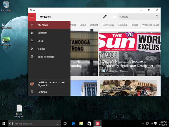
The News app in a desktop window in Windows 10.
In Windows 10, Microsoft shoved those Windows Store apps into proper, moveable, resizable desktop windows, which enables you to integrate them into your workflow far more seamlessly. Gone are the awful hidden Charms bar controls, replaced by a proper menu bar, and thanks to their scaling interface the newly “universal” Windows apps that ship with the system now feel much more natural on the desktop.
I banished Windows Store apps from my Windows 8 workflow entirely, but happily use their Windows 10 counterparts daily. The small changes add up to a huge improvement. Windows are coming back to Windows, folks.
3. Better “Metro” integration all around
The interface formerly known as Metro is far more seamlessly integrated in Windows 10.
Whereas the desktop and Metro felt like dueling interfaces in Windows 8—being ripped from the desktop to a full-screen Metro app when you opened a file was so damned frustrating—they’re complementary in Windows 10, largely because of the Windows Store app and Start menu improvements mentioned previously. The eradication of the disastrous Charms bars is another firm step in the right direction. Now, when you have to use Metro elements while in the desktop, it occurs while in the desktop, and the benefit of that can’t be overstated.
4. The right interface for the right device
But ignore all that if you’re using a Windows 10 Phone or tablet, each of which uses a morphed version of Windows 10 to display an interface best suited for each screen size. Windows 10’s tablet mode, in fact, looks an awful lot like Windows 8’s Start screen.
Microsoft tried to sell Windows 8 as an operating system for every device, but it did so by forcing the same interface across tablets and PCs—two very different device types. Windows 10 tweaks the formula, letting a PC be a PC and a tablet be a tablet, and it’s vastly better for it.
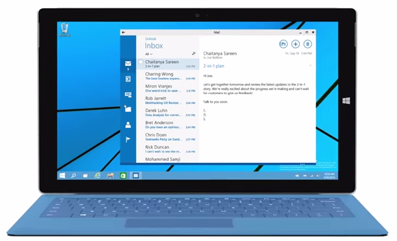
Windows 10’s Continuum feature helps hybrid devices like the Surface behave like a tablet when it’s standalone, and like a PC when the keyboard’s connected.
And if you’ve got one of those fancy two-in-one hybrid devices? Windows 10’s Continuum mode has you covered. Heck, thanks to Windows 10’s shared core and universal apps Windows 10 Phones can even mime proper Windows 10 PCs when connected to an external display.
5. DirectX 12
Not all of Windows 10’s improvement focus on slapping a Band-Aid over Windows 8’s ghastly design. Microsoft hopes to lure gamers firmly entrenched in Windows 7 over to Windows 10 with the inclusion of DirectX 12, a turbo-charged version of Windows’ popular graphics API technology.
Further reading: DirectX 12 FAQ: All about Windows 10’s supercharged graphics tech
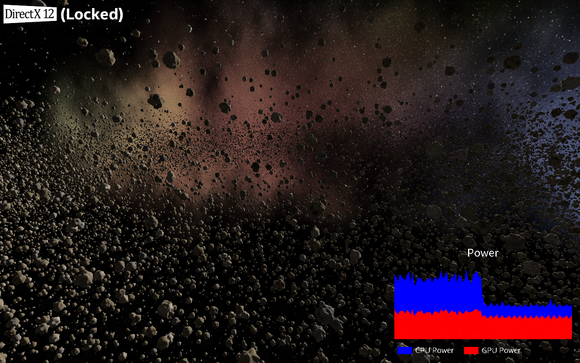
DirectX 12, like AMD’s Mantle before it, allows for vastly improved CPU utilization in gaming scenarios and provides developers closer-to-the-metal access to graphics hardware. The end result: Intel and Microsoft say frame rates can increase by more than 50 percent when the same application is run in DX12 rather than DX11—or, alternatively, power draw can be halved. Wowza.
 Intel
IntelIntel and Microsoft’s DirectX 11 vs. DirectX 12 demo.
Our own early DirectX 12 testing, conducted with 3DMark’s synthetic API Overhead feature test, shows that the potential performance leap with DX12 is insane—once games start being published that use the new API, of course. Look for those to land later this year.
6. Virtual desktops
Windows 8 treated the Windows desktop as just another app. Windows 10 gives you desktops and desktops and more desktops, via its new embrace of virtual desktop—a feature long beloved on Linux and OS X.
Further reading: How to use Windows 10’s Task View and virtual desktops
Windows 10 supports as many virtual desktops as your hardware can handle, rather than placing an artificial cap on the action. Management of the individual desktops and their apps is handled via Windows 10’s surprisingly slick Task View, which can be accessed by its icon in the desktop taskbar.
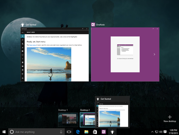
FINALLY.
Virtual desktops can be especially handy if you don’t have multiple monitors: You could dedicate one to social tools, another to work applications, and a third to PC games, for example, so you aren’t tempted to goof off in the middle of a hot and heavy productivity session.
7. Yet more power user tricks
Between the Start menu, DirectX 12, and virtual desktops, Microsoft’s clearly hoping to coax PC power users who avoided Windows 8 like the plague over to Windows 10—but the bribery and enticements don’t stop there.
Windows 10 is loaded with more enthusiast-level tricks, from display scaling improvements to greatly enhanced Command Prompt tools (paste support, yay!) to the ability to Snap four open windows to the four corners of your screen. If Windows 8 was Microsoft’s disgusting attempt to win over the hearts of mobile users, Windows 10 is a flat-out apology letter to PC enthusiasts.
8. Action Center
Windows 8’s Windows Store apps may not have been a pleasure to use on proper PCs, but one key advantage they held rocked my socks: System-wide notifications. Where traditional desktop software tends to be self-contained silos, Windows Store apps will shoot you a pop-up notification in the upper-right corner of the screen when, say, you get a new email or a new direct message in Twitter.
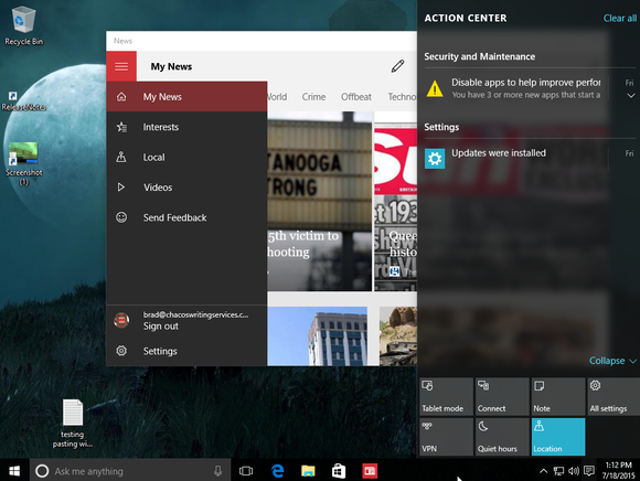
Windows 10’s Action Center slides out from the right edge of the screen when summoned.
If you see them, that is. After a notification pops up in Windows 8, it disappears into the ether, never to be seen or summoned again. Sure, you could theoretically see missed notifications on their apps’ individual Live Tiles on the Start screen, but who hangs out there?
Windows 10 cures the ill with the introduction of its new Action Center, which appears in the right-hand side of the taskbar. Missed notifications will reside there until you dismiss them—huzzah!. You’ll also find quick-action buttons that allow you to swiftly manage Wi-Fi and Bluetooth, enter Tablet Mode, and more.
9. Cortana
Windows 8.1’s search function already pulled info from the web with the help of Bing, but the results were just a dumb web search and you had to travel to the Start screen to conduct one. There was no way to quickly search for something from the desktop without the help of third-party software. Ugh.
 Mark Hachman
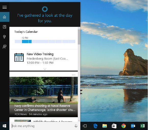
Cortana shows what you’ve got going on today when you activate her in Windows 10.
Cortana, the digital assistant that first appeared in Windows Phone 8.1, replaces the search function in Windows 10 and delivers a flat-out superior experience to Windows 8.1’s search. First of all, her search bar is located right within the desktop task bar—already a vast improvement.
Further reading: Meet Cortana: The Ultimate guide to Windows 10’s digital assistant
Cortana’s also powered by Bing, but uses machine learning to provide a personalized summary of your day, surfacing calendar details and news she thinks you’ll find interesting when you open the interface. Cortana responds to voice commands as easily as typed ones, and also understands natural language commands. You can tell Cortana to “Find pictures from June,” for example, and the assistant will even include your OneDrive-stored files in the results. Simply put, Cortana’s great—as long as you don’t mind providing personal info to Microsoft.
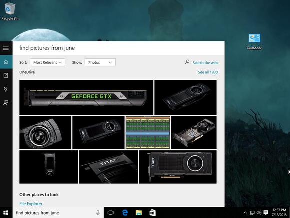
Cortana also groks natural language search commands.
Plus, Cortana’s sassy—though not all of the cool easter egg questions that Cortana answers on Windows Phone work on the Windows 10 desktop just yet. (Be sure to ask Cortana what she thinks of Siri!)
10. Windows Hello
Windows 8 had the usual authentication options—PIN code, password, yadda yadda yadda. Nothing lacking, but nothing exciting either, in other words.
Windows 10 kicks things up a notch with enhanced support for two-factor and biometric authentication, spearheaded by the awesome Windows Hello feature, which (among other things) can use depth-sensing cameras to automatically log you in.
As PCWorld’s Mark Hachman wrote in his Windows 10 pre-review after spending some hands-on time with Hello:
“Boy, Hello is terrific. You simply ‘train’ the machine by letting the PC camera look at you for a moment or two. Thereafter, when you sit down at your PC, it recognizes you and logs you in—no effort required. And if you share that PC with others in your family, it will recognize them, too, automatically logging them in and picking up where they left off.”
Facial recognition is nothing new, but Hello’s flavor of it sounds uniquely special. Too bad it’ll only work with a handful of PCs when Windows 10 launches.


