
 Image: IDG / Hayden Dingman
The start of a new year is a good time for reflection, and as we head into 2018 I think it’s time to take on a big one: How much do a game’s graphics actually matter?
It’s an old discussion. Around the time of the Xbox One and PlayStation 4 launch I remember a lot of discussion about whether we needed new, more powerful consoles. That was four years ago and even then the conversation was old. And as a PC gamer primarily, I can understand the counterpoints—there’s a thrill to good-looking games, to those “Can it run Crysis?” moments when the answer is “Yes, it can.”
But 2017 marked the confluence of two opposing trends coming to a head, and as such is a uniquely appropriate moment to resurface the discussion. On the one hand, you had the industry’s giants resorting to underhanded monetization tactics (mostly loot boxes) to ostensibly offset the ballooning costs of development. Then, on the other end, there was a resurgence of B-tier games that, albeit “ugly” on a technological level, were markedly better (and probably had more of a lasting impact) than most of their more-polished brethren. Which raises the question: Is the graphics arms race worthwhile?
Mutual assured destruction
Tangential to that question is another: “Who does the graphics arms race benefit?” Conventional wisdom seems to say it’s the players, and thus the players who constantly demand more photorealism. And that pressure is certainly out there—hell, I’ve fallen into it on many occasions. Every year we update our list of the best-looking games, which is part and parcel with that Crysis mindset.
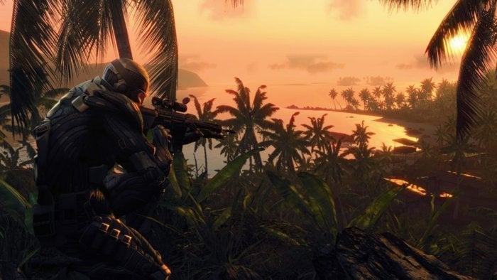 Crysis
You know what? Even a decade later, these Crysis screens still look pretty damn good.
But I think publishers actually backed themselves into this corner. Graphics are an easy and obvious selling point. Want people to buy a newer, more powerful machine? Make games so pretty they won’t run on the old one. Want to sell people on a sequel? Make it look better than its predecessor. Want to get attention during a visually packed E3 press conference? Make a game that’s heads-and-shoulders better looking than the 25 other games sharing the ticket.
Graphical prowess caters to publishers’ strengths (lots of money) and avoids their weaknesses (taking risks). They’re an excellent marketing point for games that are otherwise average.
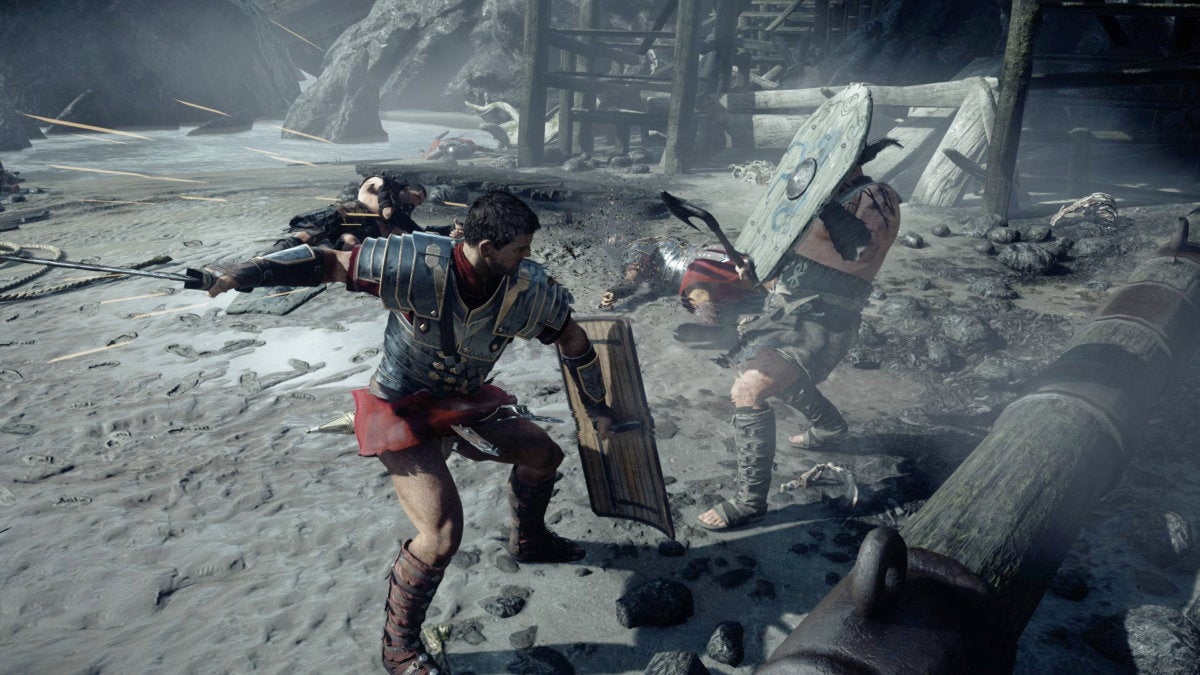 Ryse: Son of Rome
Ryse: Son of Rome was the best 2013 had to offer.
Mentioned in this article
Xbox One S 500GB Console – Forza Horizon 3 Hot Wheels Bundle
 Price When Reviewed:$279.99Best Prices Today:$405.99 at Amazon | $699 at Walmart
Ryse: Son of Rome is a favorite example of mine, both because it’s recent and because it’s so staggeringly mediocre. At the Xbox One’s launch, it was indeed gorgeous—a showcase for the new console generation. Even a year later it was a pretty stunning PC game. Three years on from that though? It looks…fine. Still pretty good actually, but it’s no longer the jaw-dropping spectacle it was at launch. And given that the game itself is ho-hum? Into the dustbin of history it goes, never to be installed again. There’s just nothing about it to recommend, once its key feature (visual whizzbangs) has been surpassed.
That’s the reality of this particular arms race—supremacy is both fleeting and empty. Games don’t get uglier, but relative to the average they do. First a handful of games match the front-runner, then a few years on the majority do, and then 10 years later even Bethesda’s open-worlds catch up. (I kid…but only barely.)
There’s a constant tide of mediocre games coasting by on wax wings, skirting the sun to see how close they can get to photoreal. From this generation alone I can name Watch Dogs, The Division, Star Wars Battlefront, Call of Duty: Infinite Warfare, Ghost Recon: Wildlands, and Assassin’s Creed: Syndicate, in addition to Ryse. All mediocre games that received an undue amount of attention because they looked good. There are probably more. It’s a pervasive problem.
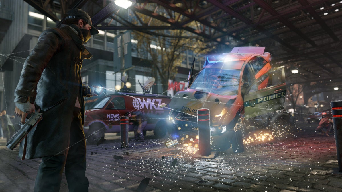 Watch Dogs
Remember that first Watch Dogs E3 presentation?
Mentioned in this article
Uncharted 4: A Thief’s End – PlayStation 4
 Price When Reviewed:$59.99
Even games people enjoy aren’t immune. This isn’t a PC game but Uncharted 4 is, in many respects, just another Uncharted game. Take a moment from Uncharted 4, hold it up against its predecessors, and aside from the graphics bump you’d likely be hard-pressed to tell the difference.
De-makeover
In a vacuum, that’s fine. That’s something I should note here. The pursuit of photorealism is fine, and has been a constant backdrop for the games industry for 40 years.
But the problem I think arises when publishers sabotage other components of the game (i.e. mechanics) because another part (graphics) costs so much it’s unsustainable. Especially since, as I’ve argued, graphical advances are ultimately an unsatisfying yardstick.
Which brings us to 2017 and why it was so fascinating: Some of the most critically acclaimed games of the year were ugly.
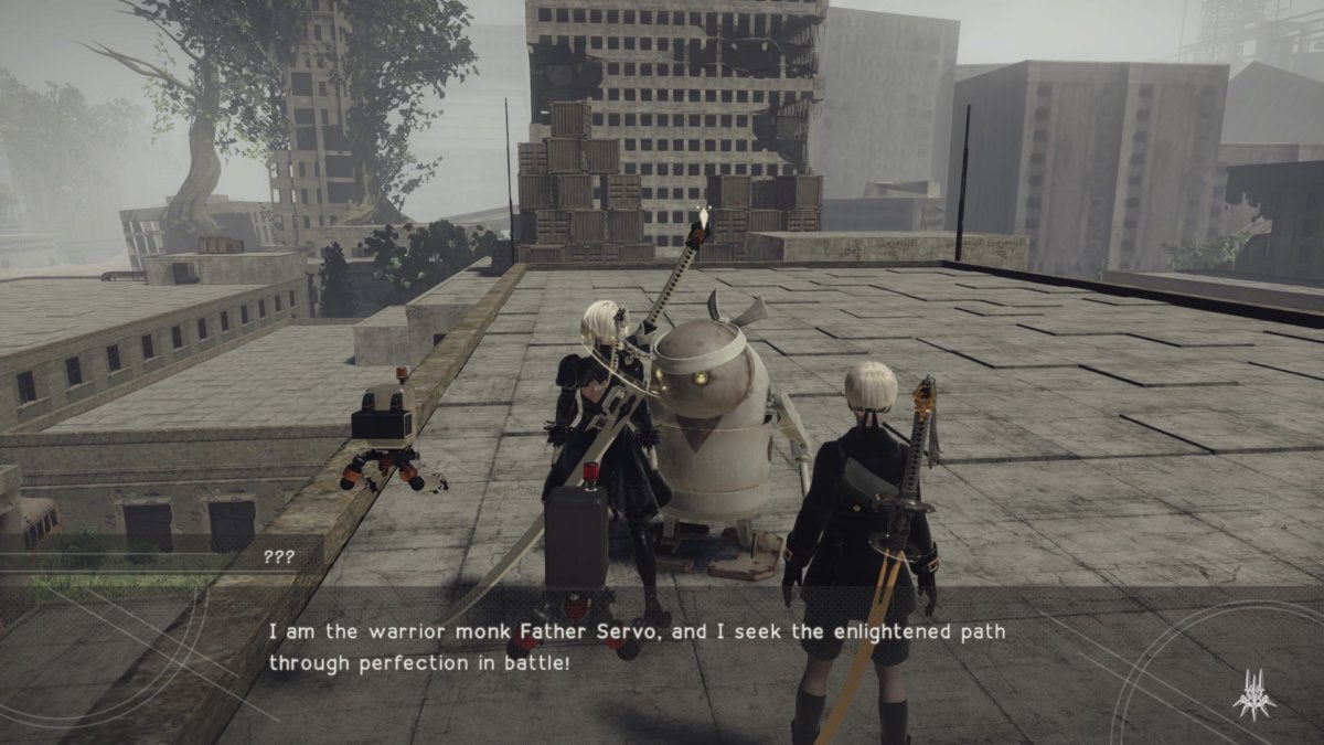 IDG / Hayden Dingman
This is a screenshot from 2017. One of 2017’s best games.
I don’t just mean “They had a different art style,” either. The current iteration of this “Do graphics matter?” discussion I’d say stretches back to around 2007/2008, when indie games started becoming a mainstream factor and, for many players, brought along more interesting ideas than those emerging from the so-called AAA space. Lo-fi games like Braid and Aquaria garnered critical acclaim while still utilizing budget-friendly art styles that could be handled by small teams. That trend continues to this day, with Stardew Valley, Undertale, Dead Cells, Night in the Woods, and more garnering success with unconventional aesthetics.
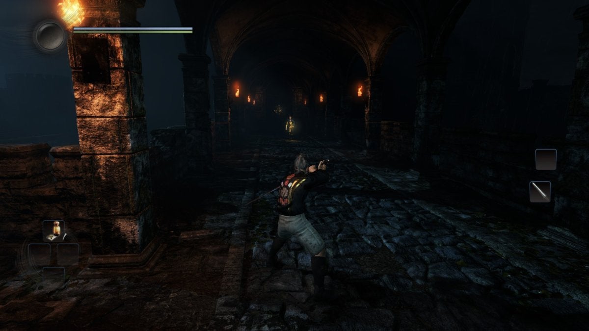
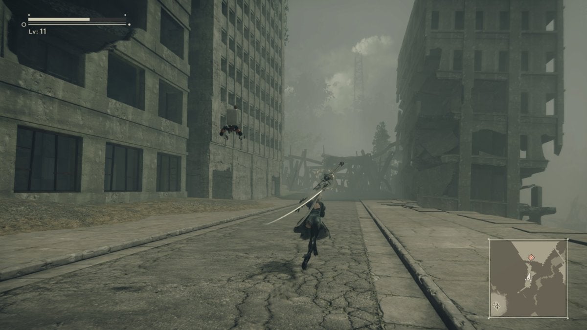
More power to them, but that’s not what I’m talking about here. I’m talking Nier: Automata. I’m talking Nioh. I’m talking about games that are conceptually big-budget—Nier an open-world action-RPG, Nioh a twist on Dark Souls—but with comparatively inferior visuals.
 IDG / Hayden Dingman
Nioh, another of 2017’s best games…and also ugly.
Both those games landed on our Best Games of the Year list, and both received widespread critical acclaim. Nier: Automata’s ruminations on the nature of humanity are arguably some of the most advanced the industry’s turned out, and it does so while overturning dozens of game design tropes and combining genres at will. Nioh is less weird, being predominantly a Dark Souls-like in a sea of Dark Souls-likes, but it overhauls combat in ways that, as I said during Game of the Year, make it the first Souls-like to feel like an evolution instead of purely derivative.
Point being: Nier and Nioh are incredible. And ugly.
Nier in particular. Not only does its world mostly consist of generic gray buildings, but they’re ugly gray buildings. Boxy, bland, repetitive, often with invisible walls to add to the frustration that arises from navigating its barren environments.
 IDG / Hayden Dingman
Inspiring.
Nioh’s opening hours aren’t much better though, with a tutorial level that takes place in the most uninspired castle walls I’ve ever seen, featuring the kind of tiled-wall look you’d expect from a 90’s shooter more than one of 2017’s best action games. The situation improves after that opening level, but even at its best Nioh looks a bit last-generation.
Mentioned in this article
The Legend of Zelda: Breath of the Wild
 Price When Reviewed:$59.99Best Prices Today:$42.99 at Amazon | $59.99 at Best Buy | $59.99 at GameStop
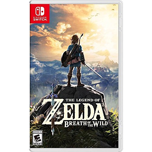
There are others I’d include here too. The Evil Within II has a strong art style, but often looks less photoreal than even its predecessor. The Legend of Zelda: Breath of the Wild wasn’t a PC game, but the Nintendo Switch’s slightly-better-than-PS3-hardware supports a game that looks (surprise!) slightly-better-than-a-PS3-game and yet still managed to capture people’s imaginations for hours upon hours.
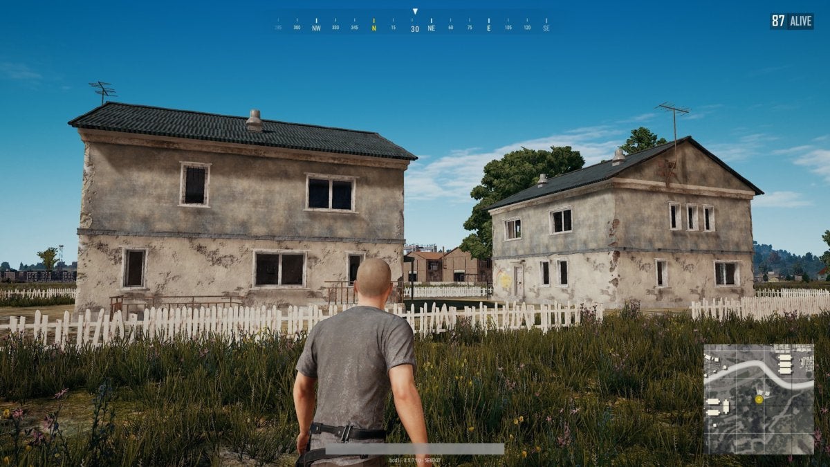
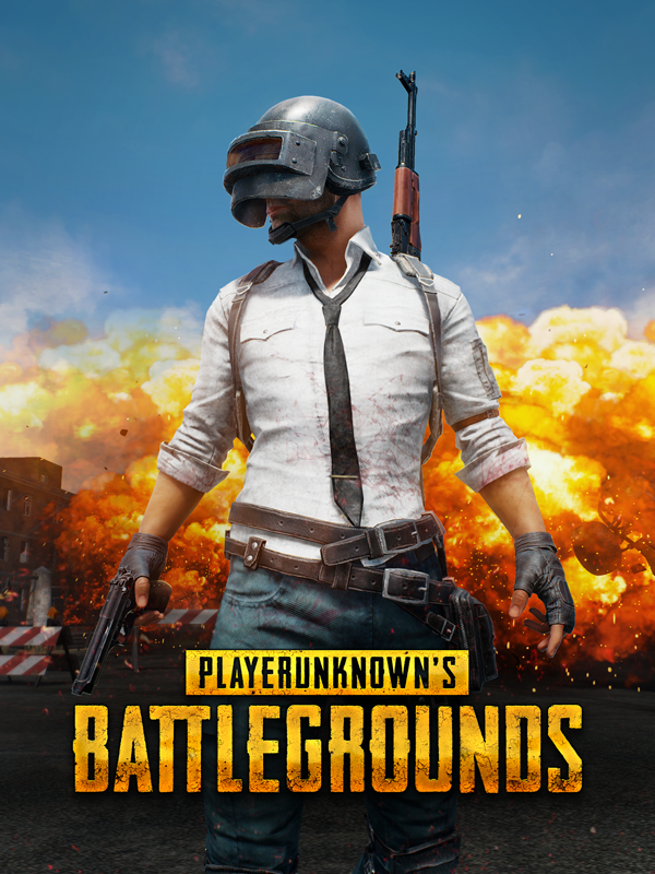
And then there’s Playerunknown’s Battlegrounds. It’s a cultural phenomenon, the record-breaking most-played game ever on Steam…and it looks like an asset flip. (Meaning it looks like a low-effort game assembled from generic general-purpose art assets sold by Unreal/Unity.) The buildings are a handful of simple models repeated ad nauseum, the characters are ugly, the greenery is just plopped in. The new map is better, but still a far cry from any publisher’s tentpole releases.
 IDG / Hayden Dingman
This is literally the same house rotated and placed next to itself. And yes, this is the 1.0 release.
Nobody cares. It’s the freshest shooter since Modern Warfare—coincidentally, also a 2007 game. Ugliness is something people are willing to put up with because the game excels in other areas.
Mentioned in this article
Playerunknown’s Battlegrounds
 Price When Reviewed:$29.99
PUBG alone should be proof enough that the narrative of “People want better graphics and we have to deliver” is mostly self-serving. It’s an argument made by entrenched publishers that mostly benefits the same entrenched publishers, because it plays to their strengths. There was a story around the launch of Assassin’s Creed: Unity where one artist spent over a year rendering its extremely detailed recreation of Notre Dame. A year! Nobody but a handful of studios at the top can afford that, and I suspect this is in part why the graphics arms race continues and will continue—as long as it does, it lets those studios retain some artificial importance, keeps their hold on the industry.
One step back, two steps forward
The truth though is that they can’t afford it. Like most arms races, the only possible outcome is still destruction. And staving off that destruction is what’s led to 2017’s loot box fiasco, as publishers try to make up for spiraling budgets. If you hate loot boxes, it’s past time to devalue the notion of graphics, to push reset (or at least pause) on development costs.
Look for games that exert more effort in other areas. Praise them. Recommend them to people. Games need their “Don’t judge a book by its cover” equivalent. It might mean fewer “Can it run Crysis?” moments, but it’ll result in more “Can it run Nier?” moments—ones where the game is the draw, rather than the technological yardstick. More Niohs. More Breath of the Wilds. More PUBGs. Games that evolve our interactions, push us forward in less obvious ways. Those solutions are hard to come up with and even harder to execute on, but ultimately more memorable too. They’re the games you come back to 10, 15, 20 years later.
Consider this: F.E.A.R. released in 2005 and is still often held up as the pinnacle of shooter AI, over a decade later. Who breaks that record? Because I’m more interested in that than 2017’s Crysis equivalent.


