The internet can be bad. But mmm.page might just be good.
The platform is hard to explain, but it describes itself as “Tumblr x Animal Crossing x Mii Plaza,” which is somehow more accurate than my idea of “MySpace meets Linktree, except not really.” The anonymous founder, XH, told TechCrunch, “I am also refining my conception of, and feelings about, mmm.page in real-time.”
That’s the last thing you’d want to say when pitching your company to investors, but that’s why mmm.page is so refreshing. It’s not trying to impress anyone or extract anything from its users. It’s just a canvas on which to play and interact with others.
“The long game is to keep mmm.page running independently, so that I never have to work against weird incentives,” they said.
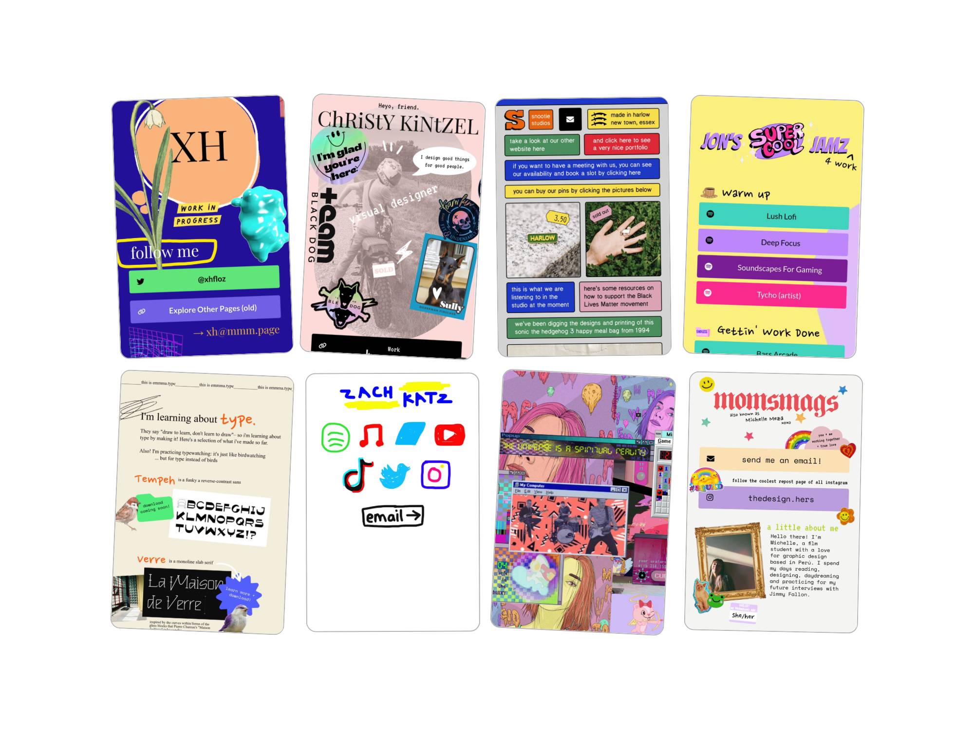
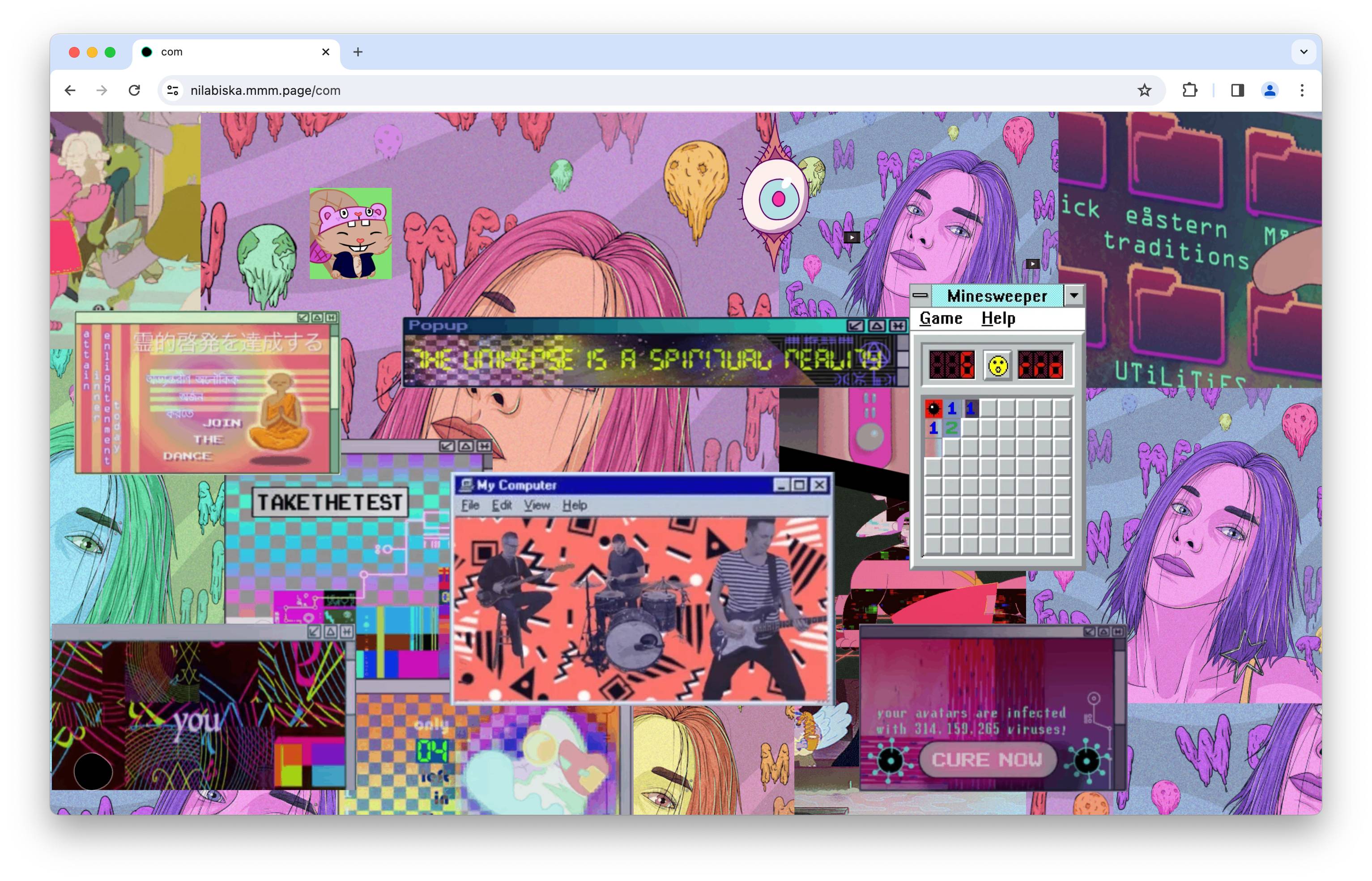
The best way to understand mmm.page is to see it. At its simplest, mmm.page is a place where you can create and design a free website (you can pay for upgrades like adding a custom domain). But the users mmm.page attracts — over 50,000 without any venture funding or advertising — are what make the platform so cool. There’s a vaporwave maximalist collage that links out to a virtual castle game and a website about lutes from 1998. There’s a six-panel comic strip made by a child about an explosion at a water park. There’s a digital poem about our relationship to technology, and what appears to be a newsletter for an event series called Frog Farm.

“I grew up on an internet filled with personal websites and niche forums that existed, sometimes, for the benefit of three people who shared an interest,” XH told TechCrunch. “It was fun to explore, and I remember feeling like I wasn’t supposed to be privy to these various subcultures from the remoteness of my suburban childhood. To a kid that kind of freedom is exciting.”
When they started working on mmm.page in 2021, XH wanted to recapture that feeling, allowing people to make sites that feel more representative of who they are than a bland Facebook page.
“The early goals were nebulous but what always served as a litmus test: ‘Do I feel the person behind this website? Do I get a hint of their personality? Their taste?’” XH said. “I’m purposefully non-prescriptive on how you use mmm.page, because I really want to see how people create websites, if it were as easy as scrapbooking.”

On mmm.page, users have developed a uniquely messy aesthetic (a messthetic, if you will), which stands in stark contrast to our profiles on websites like Facebook or X, where we’re offered so little customization.
“My sense is that we’ve just gone through a period of super efficiency and optimization. Software design patterns are heavily systemized today, which is okay, except we spend so much time online that it’s hard to discount the impact of this kind of environmental homogeneity,” XH said. “It would be as though all our buildings, sidewalks, cafes, restaurants — even clothes we wear, what we say, who we see — were rigidly controlled by a handful of companies. Like a digital landscape with the aesthetic and cultural diversity of an American supermall.”
There’s not much in the way of discovery or social features on mmm.page yet, but XH says this is something they want to build out soon, now that the bare bones are laid down.
Even if a user has no experience in building websites, mmm.page has a simple enough interface that it’s easy to figure out how to make something unique. And at the end of the day, XH’s primary goal with mmm.page is to give people room to explore their creativity.
“In the long-run, I hope the project itself begins feeling like an internet playground, and the community begins really exploring what websites can do and look like if anybody could treat it as an expressive canvas,” XH said.


