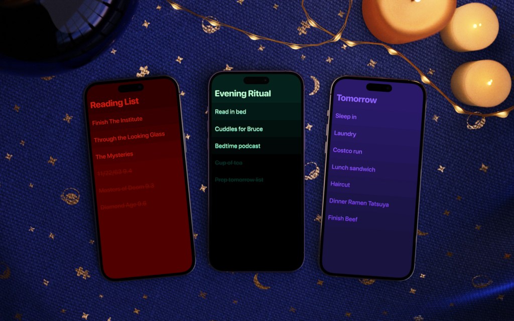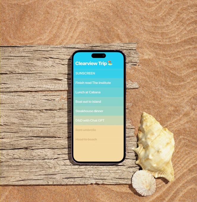
Over a decade ago, a simple to-do list app called Clear launched to much fanfare due to how it capitalized on the smartphone’s touch interface to build a new kind of app: one without buttons and menus and that is instead operated via gestures and swipes. Now Clear’s developer is debuting the next generation of the app — Clear 2 — a new version rebuilt from the ground up, but one that still heavily relies on gestures to navigate and interact with the app’s components. What’s radical about Clear this time around is not how it works, but how it makes money. Amid a sea of subscription-based apps, Clear is dropping its price to free and will monetize via a rotating daily shop where users can reward themselves for getting things done with paid cosmetics — that is, things like new app icons, color themes, sound packs, quote packs and fonts.
Explains Clear’s developer Phill Ryu, the initial love consumers had for Clear came from a feeling that it was the first app that could “only happen on the phone” — meaning smartphones with a touchscreen. At the time of its original launch, we asked Ryu if the world was ready for a buttonless app and he pointed to the ease with which even small children could navigate an iPad via touch. It was natural and intuitive, he had said.
Ten-plus years later, Ryu expected smartphone apps to have evolved more than they have. But unfortunately, Clear’s use of gestures did not become the new status quo. If anything, Ryu thinks the state of smartphone apps has gotten worse, not better.
“[They’re] more complicated, more overstuffed,” he tells TechCrunch of today’s apps. Plus, they have “all this desperate monetization stuff, like holding you hostage for core features unless you subscribe,” Ryu adds. Clear offers a specific vision for how to-do lists should work and, as an indie app, it doesn’t have to deliver increasing returns on investment or answer to investors.
“It feels a little punk compared with the average app on the App Store,” notes Ryu about Clear’s lack of subscriptions. “That’s all it takes to be punk these days,” he adds with a laugh.

Despite its age, Clear has maintained a core following who prefer its swipeable to-do’s over more traditional to-do list apps, like Apple’s Notes or Microsoft To Do, for instance. Surprisingly, Clear still has around 70,000 monthly active users and around 20,000 who use it daily.
“Not huge,” Ryu admits, “but interestingly active for an app largely static for 10 years,” he says.
The app itself hails from Ryu’s company Impending, the developer of the popular mobile game Heads Up!, and other clever apps, like the addictive, swipeable web browser Web Roulette, launched earlier this year. Impending acquired the rights to Clear from the app’s two other original developers Realmac Software and Milen Dzhumerov back in 2007 and had been teasing a relaunch of the to-do list app for years. But for most of that time, the app was just being updated on TestFlight, not on the public App Store.
The original team had kind of “burned out” on Clear, Ryu explains, after being overloaded with projects like porting Clear to Mac or adding iCloud Sync. The new Clear 2 doesn’t have those features either, aiming instead to just tap into its core customer base of iPhone users for monetization purposes.

The new version is entirely rebuilt in Swift, we’re told, but isn’t designed to be cutting-edge. There’s no AI helper, for instance.
“Maybe in the future, we’ll have some fun AI idea project idea, but I find it unlikely for Clear because we put so much work into making Clear a very quiet and pristine place, just for you and your thoughts…we almost treat that with some kind of sacred reverence,” Ryu says.
Clear 2 delivers a slate of gestures to be used for common tasks like using a back button or batch drag-and-drop. You can also drag and drop items between lists, swipe to schedule reminders, screenshot to share lists and swipe to archive lists.
Taking a cue from the free-to-play games market — or one of Ryu’s favorite “cozy” games “Animal Crossing” — the shop will be rotated daily to feature different perks.
“There has always been something actually, legitimately good about free-to-play and that whole idea, right, and it’s more the people that milked it to death that gave it a bad name,” Ryu suggests.
No longer a $5 download, Clear 2 is free with the option to buy the cosmetic features via in-app purchases at a flat rate of $2.99 apiece.
What happened to productivity apps in the past decade?
We all deserve better. Try the new Clear:
🧘♀️ Pristine with no clutter
🤌 100% gesture fluent
🎨 Beautiful + personalizable
🏆 Addictive to get things done with it
🆓 Free to useTreat yourself: https://t.co/hnLfB8IGL3 pic.twitter.com/6n7Mmsl3ut
— Clear Lists (@UseClear) January 8, 2024
Clear: Why This Simple To Do List App Has Everyone Talking


