 Image: Ian Paul/IDG
If there’s one thing Microsoft loves to do, it’s play around with the Start menu in Windows 10. The Creators Update is no different with Microsoft adding an interesting new setting for the minimalists out there.
A year ago, we looked at a way to get a Windows 7-ish Start menu without using third-party software by dumping all the live tiles. This didn’t truly give you a Windows 7 replica, but what it did was simplify the Start menu into a single column.
Microsoft is making it easier to get a similar effect in the Creators Update without dumping the live tiles. What this new setting does is create a single view where you switch between your live tiles and your app list.
 Ian Paul/IDG
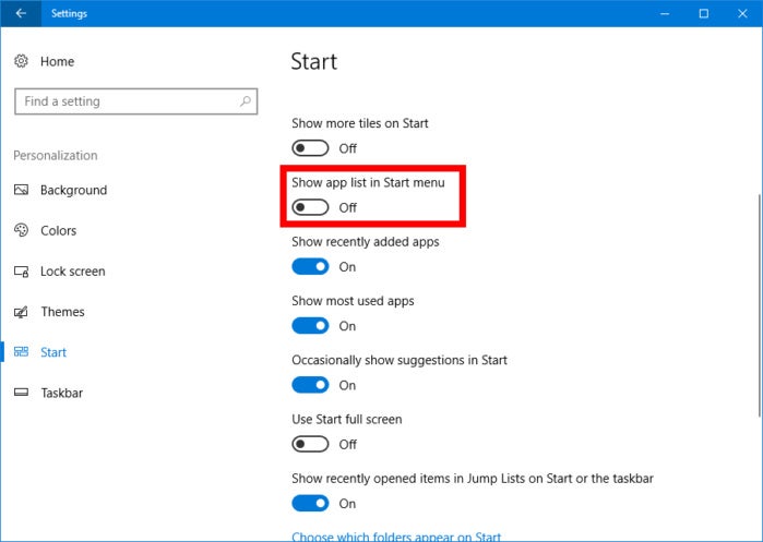
The Settings app in Windows 10 Creators Update.
To do this, open the Settings app and go to Personalization > Start. Scroll down past the preview to the list of on/off sliders. Turn off the one that’s labeled Show app list in Start menu. Don’t worry, you’ll still be able to get to your app list.
 Ian Paul/IDG
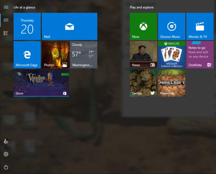
The Start menu with the app list hidden.
Now, we’ve got a single view of live tiles, but it’s still arranged horizontally. If you like that look, just leave it as is, but if you want a single column you’ll need to move all your live tile groups from the right over to the left.
 Ian Paul/IDG
The finished product.
To do this, hover over the name of the live tile group you want to move and then just click and drag. If you have difficulty moving the groups, use the two horizontal lines on the right as your click-and-drag target.
Once that’s done you should have a Start menu similar to what’s pictured here. Now, to switch between live tiles and the app list click one of the two icons in the upper-left corner.
The only downside to Microsoft’s new setting is that you can’t have the Start menu show the app list by default.
An alternative is to not mess with you Start settings and just move your live tiles over so that you have one column of tiles and one column for the app list.
Either way this is an easy way to simplify the Start menu for those who want to keep live tiles but drop the oversized Start menu.


