
 Image: Rob Schultz
Microsoft Excel’s conditional formatting is a wonderful “automatic” feature that allows you to formats cells based on the value of those cells or the value of the formulas in those cells. For example, you can specify that all the sales totals in your spreadsheet that exceed $5,000 are highlighted in yellow; or all the dates prior to the current year use a dark-green font; or use a shape or ratings icon to flag all duplicate values above 12,000. The options are endless and, in addition to all the preset formats, you can create your own custom formatting rules.
The best thing about this feature is that it provides a quick snapshot of your spreadsheet when you view it or show it to others. Because the formatting is based on values, you don’t have to do anything to make it work except update your data.
A. Format cells that meet these value conditions
1. Open a sales spreadsheet or enter a dozen names with sales totals for the first four months of 2017; that is, Jan, Feb, Mar, and Apr.
2. Highlight the Jan column of sales totals.
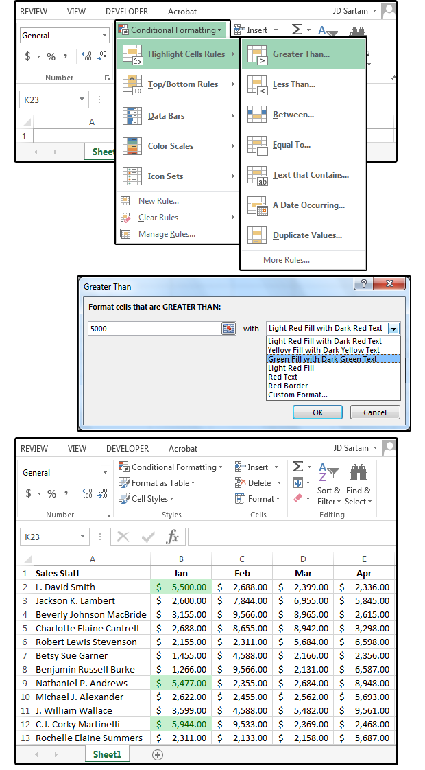
3. Select Home > Conditional Formatting > Highlight Cells Rules > Greater Than.
4. Excel displays the Greater Than dialog box. In the field box under Format cells that are GREATER THAN, enter a number (for this example, 5000) and click OK.
5. Note that all the sales totals in column B that are greater than $5,000 are now highlighted in light green with a dark-green font.
 PC World / JD Sartain
Format all cells greater than 5000.
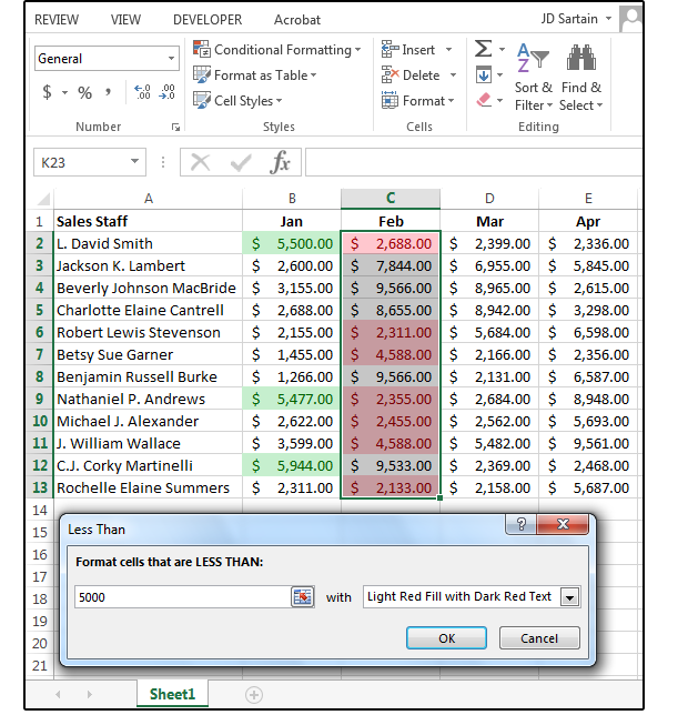
6. Use the same instructions above to highlight and format cells that are less than 5,000.
 PC World / JD Sartain
Format all cells less than 5000.
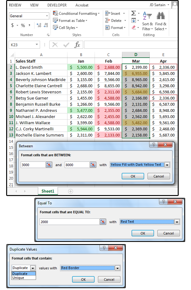
7. The other options that apply to values are Format Cells BETWEEN two numbers, Format Cells that are EQUAL TO a specific number, and Format Cells that CONTAIN Duplicate or Unique values. Note the highlighted cells in the Mar and Apr columns.
 PC World / JD Sartain
Format cells between two numbers, equal to a specific number, or containing unique or duplicate values.
B. Format cells that contain specific text
You can also use the Conditional Formatting feature to make certain text (letters, word, phrases, etc.) stand out.
1. Highlight the first column (A) of names.
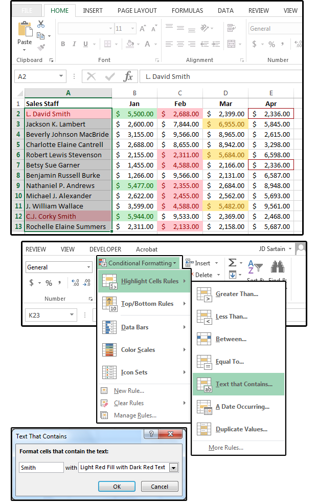
2. Select Home > Conditional Formatting > Highlight Cells Rules > Text that Contains.
3. Excel displays the Text that Contains dialog box. In the field box under Format Cells that Contain the Text, enter the text you’d like to highlight (e.g., Smith) and click OK.
4. Note that all the Smith names are now highlighted in light red with a dark-red font.
 PC World / JD Sartain
Format all cells that contain specific text.
C. Format cells that contain a Date within a range
1. Enter some dates in column F.
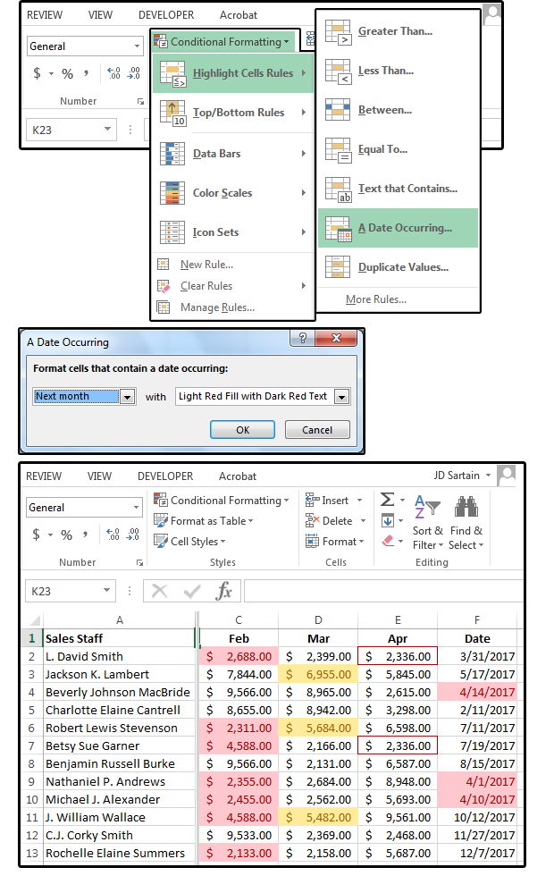
2. Select Home > Conditional Formatting > Highlight Cells Rules > A Date Occurring.
3. Excel displays the A Date Occurring dialog box. In the field box under Format Cells that Contain a Date Occurring, enter a date range such as Today, Yesterday, Tomorrow, This Month, Next Month, etc., and click OK.
4. Note that all the dates for April are now highlighted in light red with a dark-red font.
 PC World / JD Sartain
Format cells that contain a Date within a range.
D. Top/Bottom rules
The next section of Conditional Formatting features Top/Bottom rules, which provides formatting for the Top 10 Items, Top 10%, Bottom 10 Items, Bottom 10%, Above Average, and Below Average items. The Top and Bottom Percent and the Top and Bottom Items are self explanatory, right? In each highlighted range, Excel formats the highest or lowest numbers and the highest or lowest percent.
1. Highlight column B.
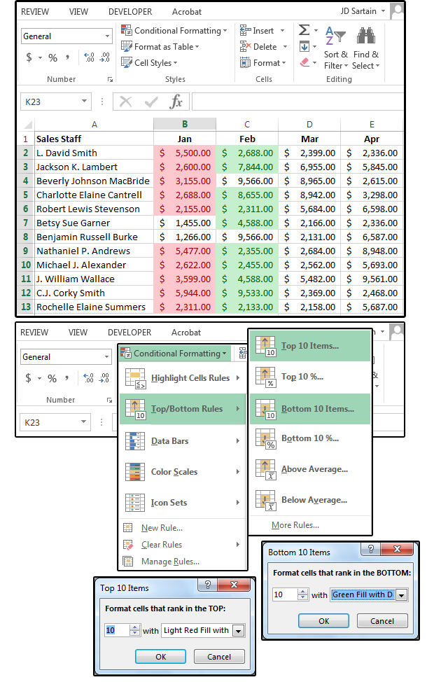
2. Select Home > Conditional Formatting > Top/Bottom Rules > Top 10 Items.
3. Excel displays the Top 10 Items dialog. The system defaults to 10, then prompts for a preset format. Select Light Red Fill with Dark Red Text, and click OK.
4. Next, highlight column C and follow the instructions above to format the Bottom 10 Items.
 PC World / JD Sartain
Format cells for the Top 10 or Bottom 10 Items in a range.
5. Highlight column D.
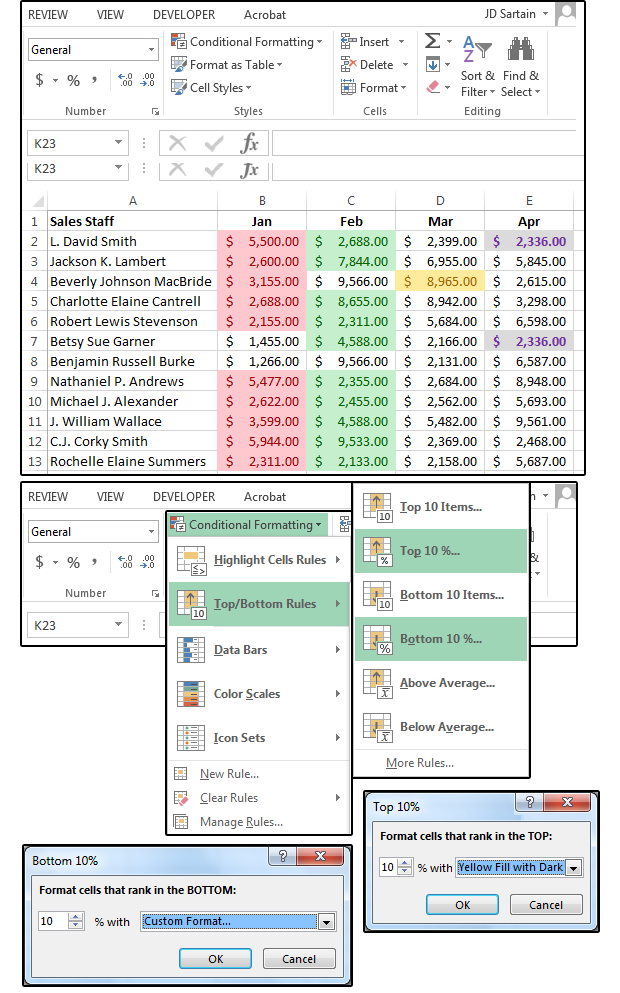
6. Select Home > Conditional Formatting > Top/Bottom Rules > Top 10%.
7. Excel displays the Top 10% dialog. The system defaults to 10, then prompts you for a preset format. Select Yellow Fill with Dark Yellow Text, and click OK.
8. Next, highlight column E and follow the instructions above to format the Bottom 10%.
Note: You can enter any number between 1 and 9999 for the Top and Bottom Items and any number between 1 and 999 for the Top and Bottom percent.
 PC World / JD Sartain
Format cells for the Top 10 or Bottom 10 percent in a range.
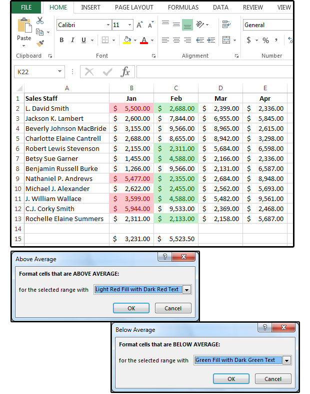
9. The Above and Below Average options are calculated like this: Excel averages the values in the highlighted column and determines the “average” number. In column B, the average is $3231. In column C, the average is 5523.50 You can check this by using the command =AVERAGE(B2:B13) and/or =AVERAGE(C2:C13).
10. Highlight column B for the Above Average formats and column C for the Below Average formats.
11. Follow the instructions above to select a preset format for each column.
 PC World / JD Sartain
Format cells for the Above and Below Average values in a range.
E. Data Bars & Color Scales
Data Bars and Color Scales are formatting tools that spice up your spreadsheets with visuals that mean something. For example, Data Bars compare values—obviously the longest bars represent the highest values and the shortest bars denote the smaller values. Conversely, the Color Scales show a range between the highest, lowest, and mid-range values.
1. Highlight column B and choose a Gradient Fill Data Bar from Conditional Formatting > Data Bars.
2. Highlight column C and choose a Solid Fill Data Bar from Conditional Formatting > Data Bars.
3. Notice that the Data Bars function like a horizontal bar chart inside each cell. Expand the column width to see a better visual for the Data Bars.
4. Highlight column D and choose a Color Scale from Conditional Formatting > Color Scales, then highlight column E and choose a different Color Scale.
5. Notice how the colors change when the numbers break, and note the difference between columns D (Mar) and E (April).
 PC World / JD Sartain
Use Data Bars & Color Scales to spice up your spreadsheets with visuals that mean something.
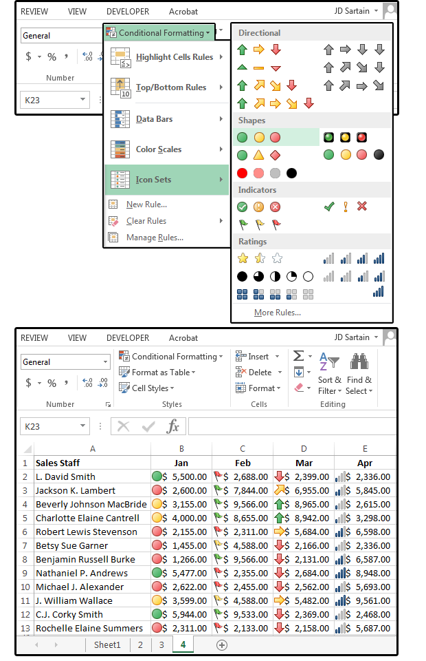
E. Icon Sets
The Icon Sets also show a range of highest, lowest, and midrange values.
1. For example, highlight column B and choose Home > Conditional Formatting > Icon Sets > Shapes and choose the first set of dots on the list. Notice that Excel averaged out the numbers in the list and determined that all 1000s and 2000s are marked with red dots, 3000s and 4000s have yellow dots, and 5000s have green dots.
2. Highlight columns C, D, and E and select one Icon Set from each of the remaining three sets. Notice the difference between how the values are grouped in the Icon Sets with three icons, four icons, and five icons.
 PC World / JD Sartain
Preset Icon Sets provide three, four, and five levels of formatting.
Note: All the Icon Sets in this group: Directional, Shapes, Indicators, and Ratings provide three, four, and/or five levels of formatting, which again, determine the highest, lowest, and midrange values. You can easily change the formatting levels to more accurately fit your specific needs.
In fact, you can customize all of the Conditional Formatting features using self-defined rules that are easy to create through Excel’s simple “walk-through” menus. We’ll cover that next.


