
 Image: Rob Schultz
One of Adobe Photoshop’s many talents at your disposal is the ability to create and decorate fonts. This tutorial is for beginners, and the instructions are applicable for Photoshop Creative Suite 1 through 6.
Character attributes
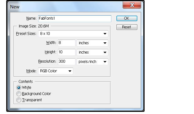
1. Open Photoshop and select File > New > Name. For this example, we’ll call it FabFonts1 and make these further choices:
Preset: CustomWidth: 8 (inches)Height: 10 (inches)Resolution: 300 (pixels/inch)Color Mode: RGB (Background) Contents: WhiteThen click OK.
Three important tips:
Use 300 (pixels/inch) for printed materials and 72 (pixels/inch) for Internet/website images. Be aware; however, that once you create your image at 72 ppi (pixels per inch), you cannot enlarge it to 300 ppi (called Resample) successfully. The enhanced image will suffer from something called compression noise—fuzzy, bloated, distorted pixels that create blurry halos around all the objects in the image. Create your “new” Photoshop files at 300 ppi, then scale down if necessary—reduction in pixels or size does NOT distort the image like upgrading or enlarging.Pay attention to your color mode. RGB means Red, Green, Blue. Select this Color Mode for screen, Internet, and photographs. CMYK means Cyan, Magenta, Yellow, and Black. Use this Color Mode for images or text that’s printed on your local printer, at a professional printing company or publisher. CMYK files are almost double in size to RGB files, so always work in RGB, then convert later, if necessary.If you forget to convert your RGB file to CMYK before you print it, don’t worry, the “new” printers automatically convert it for you. If, however, you upload a CMYK file to a website on the Internet, the image does not display, because the Internet does not support CMYK images.
 JD Sartain / PC World
Create a New Photoshop file.
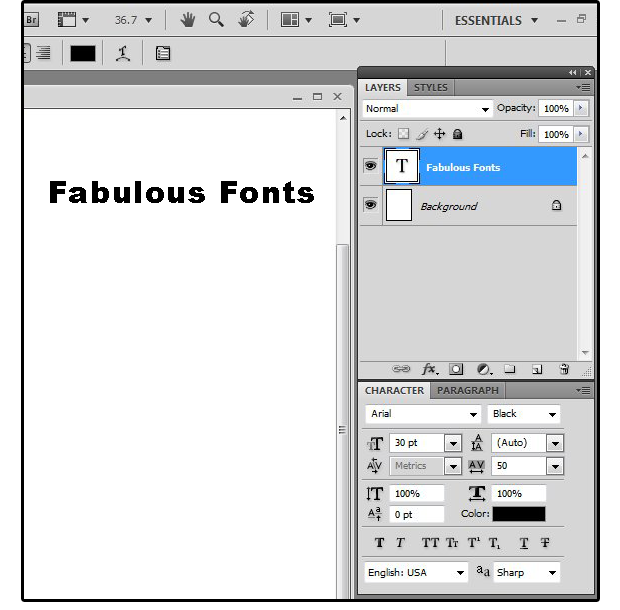
2. Select the Text/Type tool [T] and enter: Fabulous Fonts.
3. If not already open, select Window > Character, then select Window > Paragraph. Move these stacked windows to the bottom-right corner of the screen.
4. If not already open, select Window > Layers, then select Window > Styles. Move these stacked windows to the top-right side of the screen, then enlarge the window down to the Character/Paragraph window.
 JD Sartain / PC World
Enter text and open Layers, Styles, Character, + Paragraph tool windows
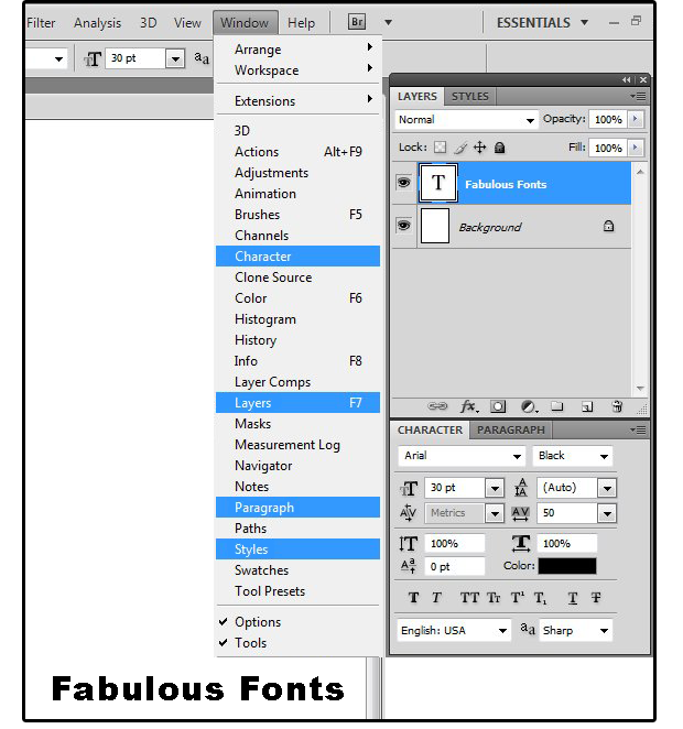
5. In the Character window, make these further settings:
Font: ArialFont Style: Black (as opposed to Regular, Bold, Italic, Narrow, etc.)Font Size: 30Leading: AutoKerning (is grayed out)Tracking: 0Vertical Scale: 100%Horizontal Scale: 100%Baseline Shift: 0Text Color: Black (or choose any color you like)
A few notes:
Kerning is the space between two characters. Leading is the space between lines. Tracking is the expansion or condensing between all characters in a selected text. Some typefaces offer these character attributes within the individual font families, e.g., Swiss Extended and Swiss Condensed.Zero is the default setting for Tracking. If you have a wide-set font, you can decrease the Tracking by preset increments (in negative numbers) or enter a custom negative number. If your font is too tight, then increase the Tracking (by preset increments) or enter a custom positive number. For this Arial font, enter 50 for the Tracking so it spreads out a bit more.
6. The characters on the next line mean this:
T (Faux Bold); T (Faux Italic); TT (All Caps); Tr (Small Caps): T (Superscript); T (Subscript); T (Underline); T (Strikethrough)
7. The last selections are for Language (English) and “aa” for Anti-aliasing: (Sharp). Anti-aliasing is a technique that smooths out the rough, jagged, pixel edges (which are square) by slightly blurring the borders of an image or character.
 JD Sartain / PC World
Define Character font, style, attributes and more.
Paragraph attributes
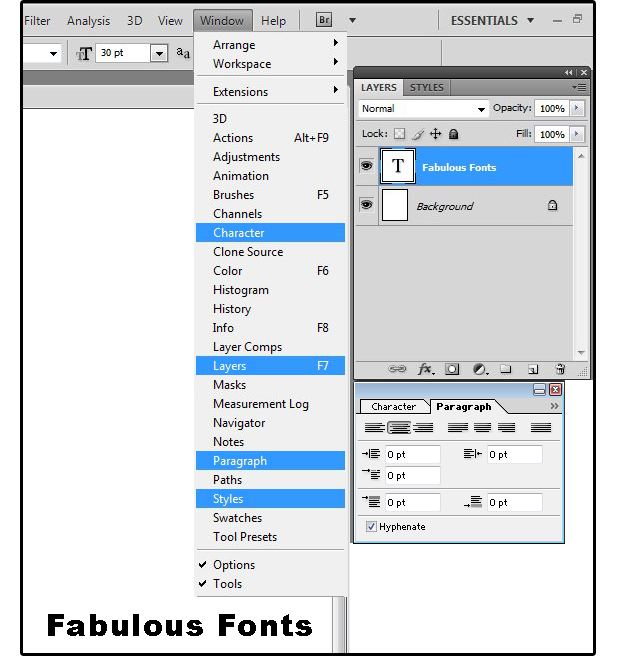
1. Click the Paragraph tab. In this window the first line/left side is Alignment: Center (the other choices are Left and Right). The first line/right side is Alignment: Justify Last Line Left, Justify Last Line Center, Justify Last Line Right, and/or Justify All.
2. The second line is Indent Left Margin: and Indent Right Margin: (if you choose to indent this word, phrase, or paragraph).
3. The third line is Indent First Line (only—like a tab—as opposed to the entire paragraph).
4. The last line is Add Space(s) Before Paragraph; and Add Space(s) After Paragraph. This is the same as Line Spacing in Word. Each space is equal to one point. So, if you enter 10 in the first one, that means add a 10-point space before each paragraph.
5. Finally, click the checkbox at the bottom if you want your words hyphenated at the end of sentences.
 JD Sartain / PC World
04 Define Paragraph alignment, margins, line spacing, etc.
Transform text
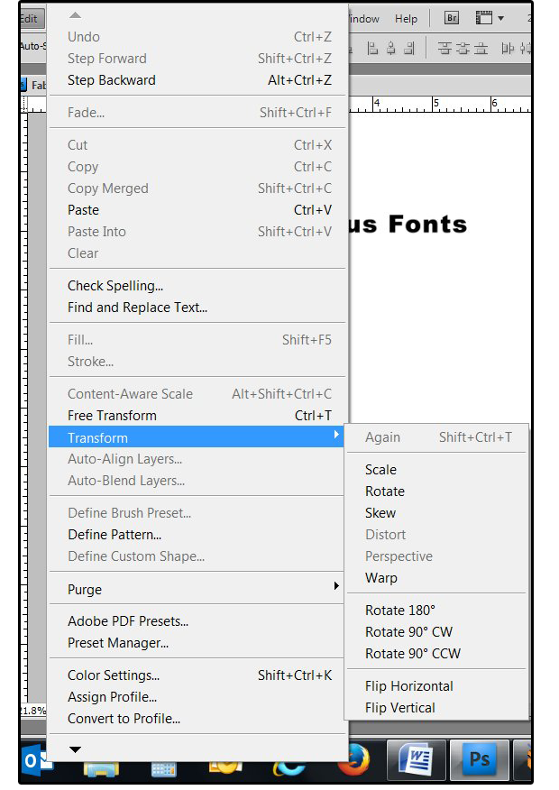
Now, let’s transform the text using one of Photoshop’s Object/Text Editing features: Select Edit > Transform, then choose a transformation effect from the list: Scale, Rotate, Skew, Distort, Perspective, Warp plus Rotate 180°, 90° CW, 90° CCW, Flip Horizontal, Flip Vertical.
 JD Sartain / PC World
Select Edit, Transform, then choose a transformation effect
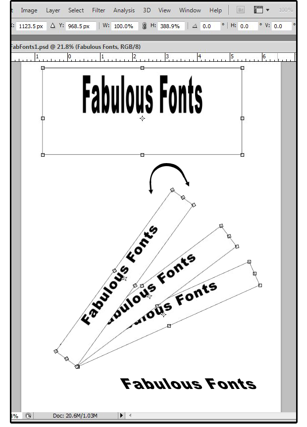
1. Scale: Increase or decrease the object or text size. You can use the field boxes across the top and physically enter the size using Relative Position by Reference Point: X and Y; by dimensions: Width and Height; or by degrees: Angle, Horizontal, or Vertical. Or, you can use the handles (top left, middle, right; bottom left, middle, right; and center left; center right) to stretch or shrink the object or text size.
You could simply increase or decrease the point size of the font if you want the text enlarged or reduced proportionately. But if you need the text taller, but not wider; or fatter, but not taller, or adjusted to precisely fit into an exact space, then use the handles and scale.
2. Rotate: This feature is self-explanatory. Again, you can use the field boxes across the top and physically enter the rotation (as described above). Or, you can use the handles to rotate the text.
3. Skew: Slants the object or text vertically and horizontally. Again, use the field boxes across the top to physically enter the skew (as described above); or, use the handles to skew the text.
 JD Sartain / PC World
Choose Scale to size text, and Rotate to swivel text
4. Distort: This is grayed-out for Text editing. For objects, you can use this feature to push and pull on any of the eight handles to completely twist, distort, or bend the object.
5. Perspective: This is also grayed-out for Text editing. Use the eight handles of this feature to alter the perspective of shapes and objects—for example, to make the front of the object larger and the back of the object smaller, adding the illusion of distance and depth to a flat surface.
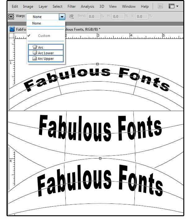
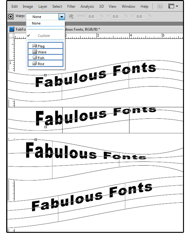
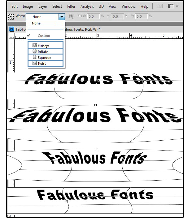
6. Warp: This one is the most fun! Use this feature to wrap your text around a rainbow, up (or down) a staircase, along the curve of a wave, while twisted, bloated, or squeezed. The options include: Arc, Arc Lower, Arc Upper, Arch, Bulge, Shell Lower, Shell Upper, Flag, Wave, Fish , Rise, Fisheye, Inflate, Inflate, and Twist.
 JD Sartain / PC World
Warp options: Arc, Arc Lower, Arc Upper
7. Once you select a Warp design, use the handles or the field boxes across the top (Bend %, Horizontal %, Vertical %) to manipulate the warped design to fit the space you need to fill.
 JD Sartain / PC World
Warp options: Arch, Bulge, Shell Lower, Shell Upper
For example, the default Bend is 50%, the Horizontal and Vertical are both set to 0.00.
 JD Sartain / PC World
Warp options: Flag, Fish, Wave, Rise
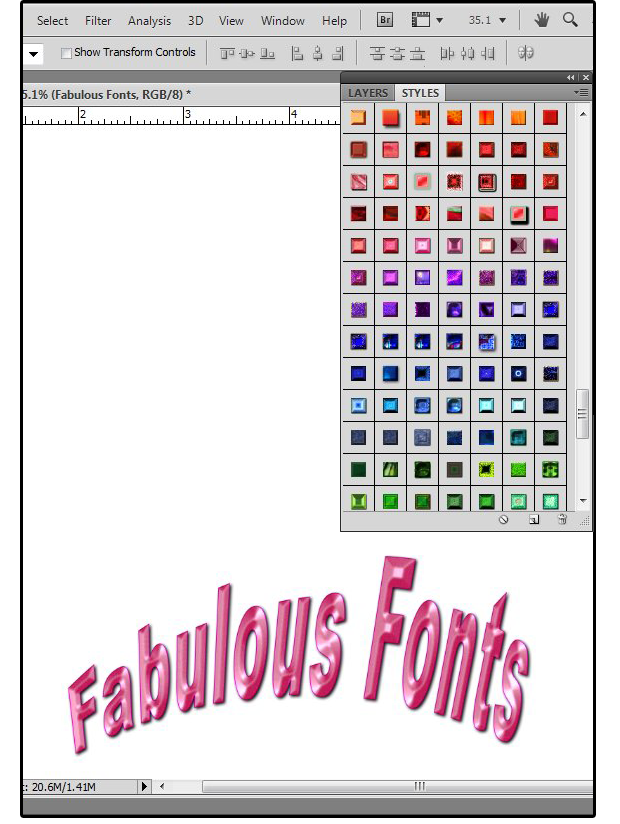
8. Look what happens when I select Arc Upper with a Bend of 90% and a Horizontal skew of 100%. If you like this warped design, click the Pointer tool, and when the Apply the Transformation dialog box appears, click the Apply button.
 JD Sartain / PC World
10 Warp options: Fisheye, Inflate, Squeeze, Twist
9. Next, apply a color, pattern, gradient, or Style to your warped transformation, and your creation is complete. Experiment with each of the Warp designs; the Bend, Horizontal and Vertical percentages of each design, and then notice the many hundreds of amazing Text effects you can create with this single feature.
 JD Sartain / PC World
Warp: Arc Upper with Horizontal Skew plus Color


