
 Image: Microsoft
At a Glance
Expert’s Rating
Pros
Free upgrade for Windows 7, Windows 8.1 PC ownersCortana digital assistant is potentially powerfulStart menu takes best of Windows 7, Windows 8
Cons
Still some obvious bugs at time of reviewThematically, some apps are just plain dullMicrosoft Edge browser underperforms competition
Our Verdict
Windows 10 drives the PC platform forward with its mix of powerful, productive features. Only a few bugs and design issues mar its shine.
(Editor’s Note: As promised, we’ve revisited the review with the “release” version of Windows 10, which Microsoft began pushing to PCs on July 29. Minor updates are scattered throughout, with emphasis on the Windows Hello and Edge sections and bugs that were present in earlier code.)
We may as well refer to Windows 10 as a date, or an hour, as much as an operating system. It’s a moment in time. A month from now, it will have changed, evolved, improved. But right now? Microsoft has shipped an operating system that was meticulously planned and executed with panache, but whose coat of fresh paint hides some sticks and baling wire.
(Changed, evolved, improved—that sounds a lot like the Microsoft Windows 10 Anniversary Update, which we’ve also reviewed. The Anniversary Update covers what Windows 10 looks like after a year, so check out our Anniversary Update review for even more.)
There’s a lot to cover, so feel free to dive in—or click one of the links in our Table of Contents links to jump to a specific part of the review.
Windows 10 will keep evolving
Note that this review is not, and will never be, the review of the final version of Windows 10. Microsoft may have frozen its core operating system in advance of the July 29 launch, but the OS and its apps will be updated continually over their lifespan—which, in the case of Windows 10 itself, will be 10 years. We received multiple assurances, however, that what we reviewed was what existing Windows users received starting July 29 (remember, the rollout will be in phases), and what will be installed on new PCs from a vendor like Lenovo or Dell. And this review also reflects updates that we made after testing against the July 29 “release” code.
Let’s emphasize this—there is an incredible amount of activity going on right now. Microsoft is busy fixing bugs, hour by hour. Several issues which we noticed in a draft of this review were resolved by the time the final draft was edited. We expect this will continue.
Windows 10 is designed to welcome most Windows users. It will be a free upgrade for users of both Windows 7 and Windows 8/8.1, assuming they switch within a year’s time. Don’t dilly-dally; it’s worth it.

Several innovations sell Windows 10 by themselves. The new Start menu blends Windows 7 and Windows 8 for maximum comfort. Cortana, Microsoft’s digital assistant, serves up relevant information. A new set of reminders and updates slide in from the side, then vanish. A few quietly powerful apps, like Photos, show you the potential of Microsoft’s new “Universal” mission. Task View, a somewhat obscure feature that creates virtual desktops, could become a sleeper hit beyond the power users for whom it’s intended.
In an ideal world, Windows 10 could have baked a little longer. Quite a bit of the operating system ably demonstrates the care Microsoft took to listen to users and make substantive improvements. The UI designers also seem to have gone out of their way to make Windows 10 less in-your-face than Windows 8 was, though arguably it’s swung a bit too far in the direction of blah. But then there’s the ragged Edge browser. It could use a livelier palette, but its real flaws are functional. Microsoft promised Edge would be our browser for the modern web, and it’s not—at least, not yet.
Which Windows 10? Home vs. Professional
The first two questions you should ask yourself are this: Which version of Windows 10 is available for my computer? And which do I need?
The first question is relatively easy to answer: if you’re upgrading from Windows 7 Home or the basic version of Windows 8, you’ll receive a free upgrade to Windows 10 Home (officially priced at $119). If you own a Surface Pro or a business PC, chances are you’ll upgrade to Windows 10 Professional ($199). I tested both flavors of Windows 10, using a Microsoft Surface Pro 2 with a version of Windows 10 Professional installed on it, as well as an HP Spectre x360 with the consumer version of Windows 10.
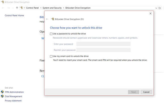
WIndows 10 Professional and Windows 10 Home are very similar, but BitLocker drive encryption is one of the value-added features of Windows 10 Pro.
WIndows 10 Professional and Windows 10 Home are very similar, but BitLocker drive encryption is one of the value-added features of Windows 10 Pro.
WIndows 10 Professional and Windows 10 Home are very similar, but BitLocker drive encryption is one of the value-added features of Windows 10 Pro.
Microsoft’s professional version of Windows 10 differs from the consumer version in many ways, but three really matter: BitLocker encryption, Remote Access, and the ability to run Hyper-V virtualization on your PC. BitLocker encrypts entire storage volumes with your hard drive and a password, with the option to print or save a recovery key to your OneDrive folder in case you forget it or are eaten by a grue. Remote Access allows you to take control of other PCs—such as those owned by relatives seeking tech support, for example—with the appropriate permissions and passwords. Hyper-V lets you create virtual partitions to test out future builds of Windows 10 (or other software), without the risk of borking your system.
Next: Hello lets you log in with your face, and the new-old Start menu
Hello: The new way to log in to Windows 10
Note: Updated on July 30 with new information.
Microsoft began insisting on a login password with Windows 8, as an additional safeguard against losing your data. With Windows 10, Microsoft is raising the bar.
During the installation process, you’ll be asked for your Microsoft username and password, the key that unlocks your data within Microsoft’s ecosystem. But instead of using that password to log in every session, Microsoft will encourage you to use a 4-digit PIN—treating your PC, essentially, as a credit card. You’ll still have the option to use a password, but a PIN is a much simpler option.
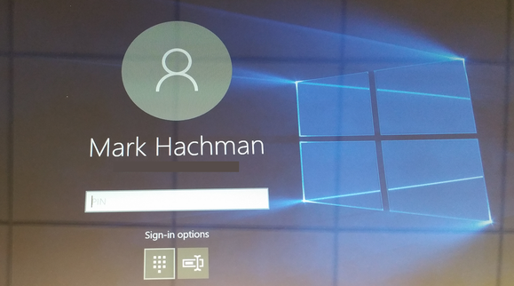
You can either use a PIN, a traditional password, or Windows Hello to log in to Windows 10.
You can either use a PIN, a traditional password, or Windows Hello to log in to Windows 10.
You can either use a PIN, a traditional password, or Windows Hello to log in to Windows 10.
A second option, Microsoft Hello, is both simpler and more secure. Using biometric security—either a fingerprint or your face—Hello will log you in, automatically. Fingerprint readers are fairly rare outside corporate machines, but the depth cameras needed for face recognition are rarer still, found only in new PCs.
See our Windows Hello hands-on for more detailed information.
Still, Microsoft’s making Hello one of the features of their first Windows 10 ads, and it’s not hard to see why. Windows Hello asks you to put your face in its camera range for a few seconds to train it, with your glasses on and off if necessary. After that, logging in is as simple as approaching the PC with the camera active. If the camera can see your face (with a Surface docking station, you may need to lean down a bit) you’ll be launched into Windows 10, literally without pushing a button.
We’ve tested Hello fairly extensively, and are convinced that this is going to be one of Windows 10’s highlights, if you can find a PC with Hello hardware installed. Setting up Hello and training it can be done in literally a minute, and the login process is nearly instantaneous. I did find that after taking a shower, dressing, and sitting down at my PC, Hello failed to recognize me. It did one other time, as well. If this happens, however, you can default to either a PIN or password and proceed normally.
I tried snapping a selfie and holding it near the camera to try and fool it, but that didn’t work. I’m not going to say that Hello is foolproof and utterly secure, but I suspect you’re going to need some sort of a mask to beat it.
Keep in mind that Hello is always looking out for you. To keep your PC from watching constantly, turn Hello off in the Settings menu.
Meet the new-old Start menu
Windows 10 newcomers, Microsoft has a treat for you. Click the Windows icon in the lower left corner, or tap the Windows key on the keyboard. The new Start experience appears, combining elements of both Windows 7 and Windows 8. You’ll find a list of your most frequently used apps to the left, along with the tile-based Windows 8 approach to the right. The live tiles periodically rotate, refreshing themselves with new updates. It’s a motif that was a little overwhelming in Windows 8, but seems more appropriate in this context.
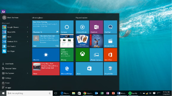
The new Windows 10 Start screen. For some Windows 8 users it will justify an upgrade all by itself.
The new Windows 10 Start screen. For some Windows 8 users it will justify an upgrade all by itself.
The new Windows 10 Start screen. For some Windows 8 users it will justify an upgrade all by itself.
Right-clicking and pinning apps to the Start menu will be intuitive for Windows 8 users, but it’s going to feel a little strange for longtime Windows 7 devotees. You can’t manually add apps to the left-hand list; Windows 10 picks those for you, based on your most frequently-used apps. Fortunately, you can also launch apps by typing their names into the Cortana search box at the bottom left, or scrolling all the way down the lefthand list to the tiny “All apps” link.
Oddly, some apps don’t show up in the “All apps” list—like Paint, the venerable, quick-and-dirty image editing app. I know it’s there, but Windows 10 doesn’t show it to me. (As some readers have noted, you can find it in the Windows Accessories folder.)

Still, Microsoft’s early vision for the Windows 10 Start screen honestly looked as good, or better, than the current version. Note the flexibility in adjusting the apps in the left-hand bar.
Still, Microsoft’s early vision for the Windows 10 Start screen honestly looked as good, or better, than the current version. Note the flexibility in adjusting the apps in the left-hand bar.
Still, Microsoft’s early vision for the Windows 10 Start screen honestly looked as good, or better, than the current version. Note the flexibility in adjusting the apps in the left-hand bar.
Microsoft will be judged on first impressions. However, not everyone will find the new Start menu intuitive. The Get Started intro app should probably be front and center to lead new users by the hand. Tips pop up occasionally, offering guidance, and the familiar toolbar sits at the bottom of the screen. There, you should see a row of icons you’ll recognize: the Cortana search bar, followed by the new Task View, an Internet Explorer-like Edge icon, and more. But the Edge icon is the only visual hint that answers the critical question most new users will ask: “So how do I get to the Internet?”
Next: Deep into Windows 10’s settings
Windows 10’s hidden depths
Despite Microsoft’s efforts to meld the best of Windows 7 and Windows 8 into Windows 10, some aspects of the new operating system are unfamiliar. Windows 7’s desktop gadgets are gone, for example. In Windows 8.1, you could access the Settings by swiping in from the right to expose the Settings charm. Microsoft killed off the Charms in Windows 10, and settings can be found in multiple places.
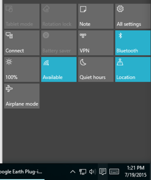
This Windows 10 Mobile-like collection of shortcuts is useful—if you know that it’s hidden at the bottom of the Notifications screen.
This Windows 10 Mobile-like collection of shortcuts is useful—if you know that it’s hidden at the bottom of the Notifications screen.
This Windows 10 Mobile-like collection of shortcuts is useful—if you know that it’s hidden at the bottom of the Notifications screen.
Let’s say you want to select a Wi-Fi hotspot to connect to. In Windows 8, you would swipe in from the right to expose the Settings charm. In Windows 10, you can click the little Wi-Fi or networking icon in the bottom right corner. Job done. But wait: To the right of the Wi-Fi icon is the Notifications icon. Click it, and it opens up a handy Windows 10 Mobile-ish array of shortcut icons, including a button to choose the Wi-Fi network—and a button to select a VPN. Why wasn’t that VPN option available in the networking shortcut? I don’t know. The Wi-Fi menu also includes a link to go to the Network Settings portion of the Settings menu, where you can specify proxies, or monitor data usage, or VPNs. By hitting Win+X, you can pull up the Control Panel with even more settings.
Whew. Yes, there’s definitely a “Who’s on First?” feeling to the various settings menus within Windows 10. But to be fair, the best place to start is with the Settings link in the Start menu. The really nitty-gritty configuration work is left for the Control Panel, but the most frequently used options reside in the basic Settings, with user-friendly toggles and pull-down menus.
Otherwise, Windows 10 automatically takes care of the basics, behind the scenes. I hooked up a number of USB peripherals to a Windows 10 machine with no issues, and routinely connected to either my work or home router. I did have an instance or two when Comcast’s connection was flaky, however, and while other devices seemed to reinstate the connection, I had to reboot my PC. Since I’ve downloaded the “release” code, however, I’ve had no issues.
Just be aware that there are hidden levels to Windows 10 that the OS hides from you—including features (like a battery saver/monitor, for example) that I’d really rather see as a desktop widget. (Some vendors, like Lenovo do offer a utility that can be placed in the toolbar.)
How does Windows 10 stack up against Windows 8.1? Well, if you look at performance, it’s essentially a tie. We’ve run dozens of benchmarks on Windows 10, and it looks like Windows 10 is slightly faster, but within the margin of error. Realistically, it’s a tie.
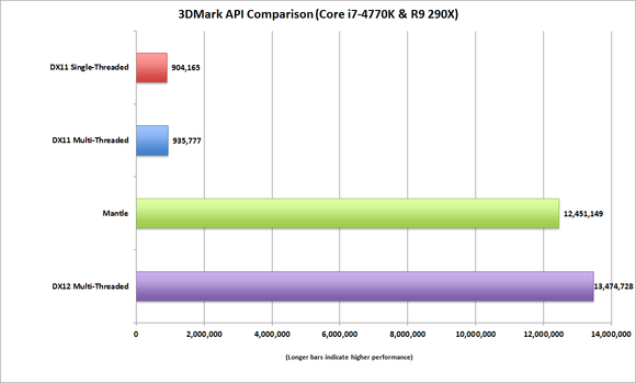
DirectX12 performance stacks up nicely against the older DX11 API.
DirectX12 performance stacks up nicely against the older DX11 API.
DirectX12 performance stacks up nicely against the older DX11 API.
Deep within Windows 10 lies DirectX 12, the latest version of Microsoft’s API that will power your system’s graphics card or chip. Those drivers ship with Windows 10, but Microsoft hasn’t really promoted them yet. DirectX 12 is potentially a very big deal, however, because our early benchmark scores show its performance could be incredibly fast. Keep in mind that this is a theoretical benchmark, however, and testing on real game engines won’t be possible for several months.
A bug in Windows 10’s drivers may also cause a small reduction (about 10 percent) in battery life with Windows 10. Intel has promised that a patch will solve that problem, but it’s not clear whether it has been released. Some PC vendors are quietly warning that turning on Cortana’s active listening mode will drain battery life, but it appears to have a small impact.
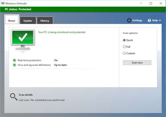
Windows Defender offers a basic level of protection, but make sure you download a third-party antimalware package—free or paid—to replace it.
Windows Defender offers a basic level of protection, but make sure you download a third-party antimalware package—free or paid—to replace it.
Windows Defender offers a basic level of protection, but make sure you download a third-party antimalware package—free or paid—to replace it.
Microsoft’s mediocre Windows Defender comes installed by default, handling antimalware and firewall duties. That’s not a dig at Microsoft—Defender is there to protect your PC in the absence of anything else—but we’d recommend replacing it with another free or paid antimalware solution. Microsoft made one other security tweak, preventing you from deferring Windows updates as was allowed in the past for Windows 10 Home users.
Like Windows 8, Windows 10 didn’t initially include any basic Blu-ray or DVD playback support, but it does now, sort of. If you’re upgrading from a PC that included Windows Media Center you should see a modern UI app on your PC called Windows DVD Player. In our tests, however, it’s not great. Instead, just download VLC—but not from the Store, which houses the crappy mobile app. Instead, go right to the source, the VLC site. One apparent plus: Region switching seems to be a thing of the past. I swapped between a Region 1 and a Region 2 DVD I’d picked up in the U.K. Both played fine, and the region counter on my USB DVD drive never budged.

If DVDs are, er, precious to you, VLC or another third-party app is the only ticket that will allow entry to a DVD player in Windows 10.
If DVDs are, er, precious to you, VLC or another third-party app is the only ticket that will allow entry to a DVD player in Windows 10.
If DVDs are, er, precious to you, VLC or another third-party app is the only ticket that will allow entry to a DVD player in Windows 10.
Windows 10 also introduces a Windows 95-era array of melodic alerts for various notifications. I’ve grown to like them.
Given that we haven’t tested Windows 10 on a broad variety of hardware, it’s difficult to gauge its stability. Patches and updates will be routine, of course. Early bugs, including an annoying tendency for my Windows 10 HP Spectre x360 to lose connection to an external monitor, appear to have been patched. Ditto for some problems that I had connecting a a Microsoft Wireless Mouse 3500 (connected via dongle) and Logitech’s MX Anywhere 2 mouse to the PC. But other Windows 10 bugs have cropped up, and there will probably be more, too.
Next: Cortana, the queen of reminders and notifications
Meet Cortana, the digital assistant of the future
Possibly the most significant addition to Windows 10 is Cortana, the digital assistant that first debuted in Windows Phone. The first thing you should do is tap the “Ask me anything” search field in the lower left and set up Cortana. Yes, Cortana noses into all aspects of your digital life—your calendar, location, interests, email, and more—but it’s worth it.
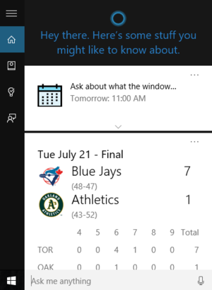
Cortana provides a handy overview of useful information when you tap the search bar.
Cortana provides a handy overview of useful information when you tap the search bar.
Cortana provides a handy overview of useful information when you tap the search bar.
On Windows 10’s lock screen, you can set up several apps to display minimal or detailed information. But tapping Cortana at the beginning of each day provides a terrific summary of what you need to know: the weather, relevant news, local interests. Just make sure you manually connect to your Office 365 account, if you can, to surface relevant work-related information.
Oddly enough, my HP Spectre x360 lacked a microphone of sufficient quality (in Windows 10’s view) to enable the “Hey Cortana” feature, which actively listens for that keyphrase as a summons. That didn’t stop it from working, although Cortana still had a disconcerting tendency to trigger multiple devices within earshot.
Voice commands take some getting used to. But there’s something so handy about telling Cortana to remind you to pick up eggs and milk at the store. Of course, you can also do this with your Windows Phone, which brings location into the equation—you can either remind yourself to buy eggs at the store, or, when you’re at the store, your phone can remind you to buy eggs. Unfortunately, once a reminder is set, it’s set—you can’t adjust the time. I also had no luck trying to set a reminder with my Windows Phone 8.1 phone and having it talk to Windows 10 Cortana behind the scenes.
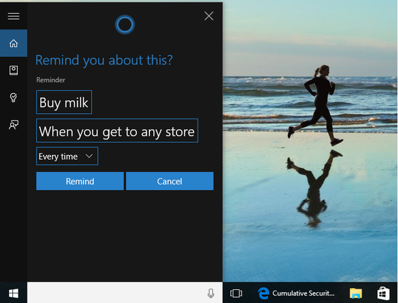
Reminders can be surprisingly detailed, but, once set, they’re not flexible.
Reminders can be surprisingly detailed, but, once set, they’re not flexible.
Reminders can be surprisingly detailed, but, once set, they’re not flexible.
Cortana even takes dictation—such as an email to your boss, for example, while you’re working on another screen.
One issue I do have with Cortana is that, like the early days of search engines, she sometimes requires specific phrasing. Saying “what can you do?” to Cortana helps establish her limitations. But commands that seem natural – “Play some Rolling Stones” – just aren’t recognized. (“Play my music” seems a little vague.) In the email example above, I had to “Send an email to Melissa,” then pick the correct “Melissa,” then dictate the email, and so on. Microsoft touts Cortana’s natural language capabilities, but there’s significant room for improvement.
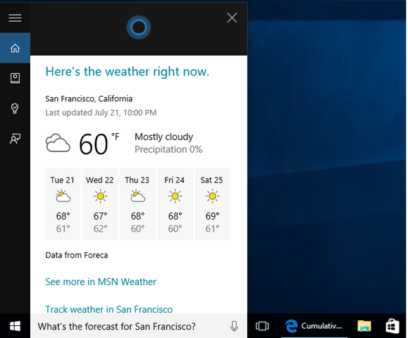
Weather reporting is child’s play for Windows 10 Cortana.
Weather reporting is child’s play for Windows 10 Cortana.
Weather reporting is child’s play for Windows 10 Cortana.
Cortana’s reminders and other updates pop up as notifications that “fly in” from the lower right. I particularly like the way Microsoft handles these. A reminder will plop itself into my peripheral vision and squat there until I deal with it. But email appears only briefly, sliding in with the sender’s name, subject, and first lines, then vanishing—tucked away in Outlook or Mail for later.
If you miss a notification, though, don’t worry. You’ll find them all archived in the Action Center notifications tab, accessed by the speech balloon icon in the lower right.
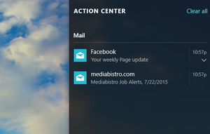
Miss anything? Check the Action Center to the right to find it. (Swipe in from the right to reveal it.)
Miss anything? Check the Action Center to the right to find it. (Swipe in from the right to reveal it.)
Miss anything? Check the Action Center to the right to find it. (Swipe in from the right to reveal it.)
I suspect Cortana will be one of Windows 10’s more polarizing features. Home users won’t mind yelling at Cortana for the answer to a question, but workers in a busy office will probably think twice about asking Cortana to email their doctor about that strange rash.
Next: Exploring the new frontier of virtual desktops
Task View/Virtual desktops: A cool tool
Working with Windows 10’s virtual desktop mode or Task View takes some work. It’s a bit intimidating in the sense that the Windows 8 Start screen was: It’s an unfamiliar interface, and requires some effort to use efficiently. In the end, though, it pays off.
You’re probably used to opening up as many apps as will fit in a window, with the remainder either unopened or minimized to a desktop. If you want to work with more apps at the same time, you invest in another monitor. Task View doesn’t necessarily minimize those unused apps; it just hides that entire screen of apps, keeping everything the way it was.
This has two practical advantages. Say you have a nicely ordered screen of apps: a spreadsheet in one corner, email in another, with a PowerPoint document taking up the other half. Suddenly, you remember that you need to cull some client feedback from an email thread. Yes, you could rearrange those apps again—or you could open Outlook on a new virtual desktop using the Win+Ctrl+D command. (You can also click the Task View icon and the “+” icon in the lower-right corner to create a new virtual desktop.)
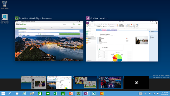
Windows 10’s Task View allows you to arrange multiple apps across multiple virtual desktops, all but one of which is hidden from view.
Windows 10’s Task View allows you to arrange multiple apps across multiple virtual desktops, all but one of which is hidden from view.
Windows 10’s Task View allows you to arrange multiple apps across multiple virtual desktops, all but one of which is hidden from view.
Task view also allows you to multitask more efficiently. Take a typical Sunday night. The weekend’s winding down, you’re not quite ready to give up Facebook and Amazon, but there’s work to be done. By creating a separate virtual desktop with Task View, you can create a separate work and entertainment space, and then flip back and forth between them using the Ctrl+Win+the left or right arrow.
That’s the key to making Task View work: the Ctrl+Win key flip. With a second monitor, you glance left or right. With a virtual desktop, the screen moves—not your head. You can flip back and forth quickly and efficiently.
Unfortunately, there are a few quirks. For one thing, if you have two monitors, both monitors flip to a new desktop with the Ctrl+Win key command—even if you don’t have a virtual desktop set up—which means you end up with a blank screen. That’s annoying. There’s also a “hard stop” at the end of the row of virtual desktops—if you keep tapping Ctrl+Win+left arrow, for example, you won’t wrap around to the beginning.
In the Settings menu, you have the option of configuring your taskbar to display every app running on your Windows 10 system, or else just the apps that you’ve tied to that desktop. Note that even if you do choose the latter, apps that demand your attention (say from an instant messaging application) should still flash on your toolbar.
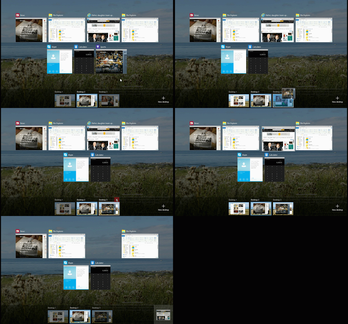
You now can drag and drop apps from one virtual desktop to another, too.
You now can drag and drop apps from one virtual desktop to another, too.
You now can drag and drop apps from one virtual desktop to another, too.
Things can get a little crazy if you start mixing and matching Alt-Tab commands and Task View. Alt-Tab creates a cloud of suggested apps to fill in the remaining space, which you can snap to the various locations via the Win+arrow key. If you do choose to hide apps that aren’t being used on the virtual desktop, you can sometimes forget and “lose” them.
Don’t be intimidated, though. There’s absolutely nothing requiring you to use Task View. It’s just an advanced tool that’s there if you want.
Next: Still waiting for the Edge browser Microsoft promised
The Edge browser isn’t fully baked
Editor’s Note: This section now reflects performance testing performed on Windows 10.0.
Windows 10 also introduces Microsoft Edge, a browser that Microsoft has touted as the answer to the demands of the modern Web.
When I initially wrote our review, I had very mixed feelings about Edge, both aesthetically and functionally. still do. Part of the issue, for me, is that Edge doesn’t feel fully finished. And it’s not, clearly, as support for Firefox-style extensions won’t arrive until later this fall. That means Edge has some breathing room, though, as Microsoft can either tweak its functionality or let third-party developers step in.
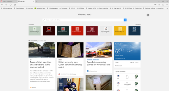
I just don’t love the design aesthetic of Edge.
I just don’t love the design aesthetic of Edge.
I just don’t love the design aesthetic of Edge.
To begin with, Edge’s UI looks spartan even compared to Chrome. When you start Edge or load a new tab, you have a choice of loading a bare search bar, or a bar accompanied by a few icons of frequently-accessed pages, or a bar surrounded by content from MSN. There’s something industrial and lifeless about it all. Even switching over to the “dark theme,” accessible via the Settings menu, doesn’t do it for me. Heck, there’s no default homepage (or button) unless you dive down deep into the advanced Settings menu and add one.
Those Settings are worth poking through, by the way. Edge loads Flash by default, which you can toggle off. Do Not Track privacy requests are off by default. Pop-ups are blocked. And there are some other very nice features – pre-loading Web pages, password management, and caret browsing – which are worth a look.
We tested Edge both with Build 10240 of the Insider track as well as the “release” version of the code, Windows 10.0. What we found was interesting.
In both code bases, I surfed to several random Web pages, using The San Francisco Chronicle’s SFGate.com site and others as test beds. I turned off all plug-ins in Chrome, and measured the time before I could scroll down and “read” the page. With the preview code, I found Google’s Chrome browser considerably more responsive, loading pages in under 8 seconds, while Edge took about 23 seconds or so. I then repeated the test the week before the launch, with random pages from SFGate, PCMag.com and Salon.com. Only the Salon page loaded significantly faster on Chrome: 5.0 seconds versus 8.3 seconds for Edge. Otherwise, they were roughly comparable.
On July 30, I tested it with Windows 10 Pro Build 10240 installation that I hadn’t updated yet. Edge loaded pages, on average, in about 10 seconds Chrome, in about 4.8 seconds. I then switched to a Windows 10 Home machine running Windows 10.0.
Here, Edge loaded pages in an acceptable 4.3 seconds or so. I found the browsing experience perfectly fine—except when I tried Chrome, it loaded pages on an average of 2.2 seconds or so. That’s nearly half the time. That ratio held up using pages from CNN.com and other sites.
I also reran a “stress test” I had performed, using 30 tabs from all sorts of media-rich Web sites. Under my previous tests using an Insider Build 10240 build, Edge tabs hung, stuttered, and became unresponsive, pegging a Core i5-based HP Spectre x360 at 98% CPU utilization and 97% of the available memory. Using the same tabs, Chrome hit 59% to 70% CPU, and 78% memory utilization. When I re-ran the test several days later, Edge loaded 22 tabs, then crashed.
Under Windows 10.0, I experienced a similar slowdown using Windows 10 Home, consuming 99 percent CPU and 90 percent of the available memory. The system was virtually unresponsive. Chrome consumed 66 percent of the CPU, and 90 percent of the memory. Edge also nearly locked up after 25 tabs, but then recovered.
From a performance perspective, I would agree that Edge has improved, especially in page-loading times. But Chrome still appears to be a better browser. Edge may indeed be “blazing fast” on the benchmarks, but I browse Web pages, not benchmarks.
From a feature perspective, however, Edge is more competitive.
Cortana’s also built into Edge, although she’s only there if you want her. You can highlight a word or phrase, right-click, and ask Cortana. A sidebar will slide in from the right, essentially a small Web page with a fuller explanation. Microsoft’s tried this trick before with Office, and it’s a useful tool.
Reading List is, too. By clicking the star icon after the page loads, you can save it to a Pocket-like Reading List for later. About the only thing I’d like to see here is either RSS integration, or a right-click option to save a page you haven’t clicked yet to the list.
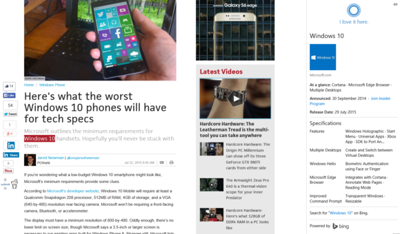
Adding Cortana, however, is a welcome feature.
Adding Cortana, however, is a welcome feature.
Adding Cortana, however, is a welcome feature.
I’m less impressed with Edge’s ability to mark up a webpage. Microsoft pitched this feature as something akin to a personalized Web, but it isn’t. Clicking the icon that looks like an overly abstract pencil in a box allows you to add notes, squiggles, even text to a webpage. The problem is that the result is stored as an image file for OneNote or other apps. So who cares? You can take a screenshot of any Web page with any browser in the world, save it to Paint, and then mark it up. I haven’t seen Edge crash when using Web notes after Windows 10.0 released, however.
Edge’s Reading Mode, which strips the unnecessary cruft out of a webpage, is a plus for Edge. For a visually distracting page with ads and popups all over the place, it’s nice. You can’t load a page in Reading Mode without viewing the page as it was originally laid out, however, a nod to advertisers and the sites that depend on them (cough).
(Note that Windows 10 actually includes two browsers: Internet Explorer 11 is still present, just hidden away. If you’d like to use it, go to All Apps>Windows Accessories>Internet Explorer and load it up.)
Edge will undoubtedly improve over time. But Chrome fans would always joke that Internet Explorer was “the browser that downloads Chrome.” Right now, Edge looks to be more of the same.
Next: Apps, Part 1: Continuum and OneDrive
Continuum: Windows 10 on the go
Microsoft designed Windows 8 with a mind toward tablets and desktops alike. Because Windows 10 is designed to function primarily in a desktop mode, it needs its own answer for tablets: Continuum.
When a tablet like a Surface (I used a Surface Pro 2 for testing) is undocked, Windows 10 by default will ask whether you want to put the system into tablet mode. The Start menu suddenly looks more like its Windows 8 ancestor: The live tiles increase in size, and Windows buries the text-based left-hand menu behind a “hamburger” menu icon on the upper right.
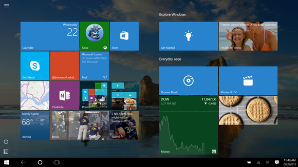
If you shift to tablet mode within Windows 10, the Start menu will be replaced with a Windows 8-ish Start page.
If you shift to tablet mode within Windows 10, the Start menu will be replaced with a Windows 8-ish Start page.
If you shift to tablet mode within Windows 10, the Start menu will be replaced with a Windows 8-ish Start page.
If you happen to be within the Desktop, your app shortcuts will disappear, leaving only the Cortana icon, the Task View icon, and what looks like a back-arrow (and is). It’s a bit disconcerting, but your apps are still there—just hidden from view until resurfaced by the Task View icon.
I do like how the software keyboard auto-suggests words, however, and wish there were a way to enable that feature when using the hardware keyboard. (Bugs, like a refusal to accept typed input or an inability to launch apps via Cortana, have been fixed.)
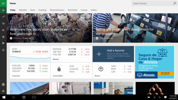
Windows 10 apps like MSN Money scale nicely to fill the screen in Continuum’s tablet mode.
Windows 10 apps like MSN Money scale nicely to fill the screen in Continuum’s tablet mode.
Windows 10 apps like MSN Money scale nicely to fill the screen in Continuum’s tablet mode.
I’d also prefer to see something, well, more like the Windows 8 Metro apps when Continuum is enabled in an undocked mode. Apps like Paint still require me to fat-finger through menus to force them to work.
OneDrive, the app that isn’t
Beginning with Windows 8, Microsoft launched the concept of OneDrive, or storing your documents in the cloud (using a decidedly ugly Metro app, no less). With Windows 10, OneDrive now is tightly woven into the operating system, showing up as just another folder inside File Explorer. You can even treat it as a shareable drive. One feature has disappeared, though: the confusing “placeholder” files that resided on your PC as a timesaving device. And that’s good.
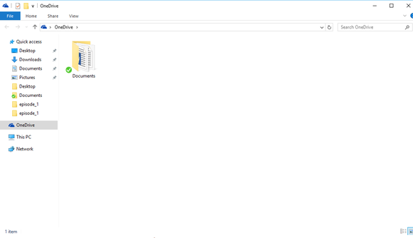
OneDrive may be listed as an app in Windows 10, bt it’s really just another folder for you to store your stuff.
OneDrive may be listed as an app in Windows 10, bt it’s really just another folder for you to store your stuff.
OneDrive may be listed as an app in Windows 10, bt it’s really just another folder for you to store your stuff.
But while OneDrive has been assimilated into the rest of Windows 10, many other apps remain as standalone applications.
If there’s one mistake Microsoft made early on with Windows 10, it’s that the apps themselves looked decidedly blah. Apps “flowed” to fill the available space. On a modern widescreen monitor, they can end up as vast, vacant courtyards with a few weeds of content pushing up. Microsoft’s answer is to minimize or snap the apps into a smaller space. What I’d rather see is some faint, self-aware backdrop tuned to the app—an album cover or band photo in the Music app, for example.
What’s impressive is that Microsoft is taking action. On July 15, I mentioned to a Windows 10 product manager that Music needed at least to sync with the user-selected Windows 10 color scheme. By the weekend, Microsoft had updated the app and fixed the problem.
Next: The Windows 10 Store and its apps
Windows apps: Sparse, sometimes great
Compared to the Android and iOS app stores, the Windows app store (known as the Store) feels rather meager. Microsoft splashes a few key apps at the top of the screen (Flipboard, Watch ESPN, Line, among others) although the enormous hero images given to each one ensure that other, equally worthy apps are somewhat buried down below. A few “leaderboards” of the most popular apps across a variety of genres help separate the wheat from the chaff.
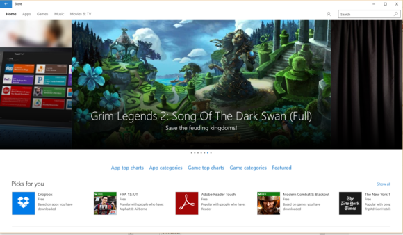
The Windows 10 Store serves as a front page for apps, games, video, and more.
The Windows 10 Store serves as a front page for apps, games, video, and more.
The Windows 10 Store serves as a front page for apps, games, video, and more.
There’s no indication as to which apps are so-called Universal apps, ready to run across Windows 10 desktop PCs and phones. A few key details are omitted, including the number of downloads. There’s also a small catch: Each app can be loaded on only ten Windows 10 devices.
You’d think Microsoft would heavily promote at least three apps in the Store: Word Mobile, Excel Mobile and PowerPoint Mobile. Neither of them ship with Windows 10, but all of the universal Office apps are available in the Store for download. Be sure you do.
Microsoft has cleaned up its language surrounding in-app purchases, a problem just before Windows 10.0 dropped.
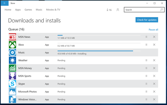
Apps are updated via the Windows Store, not via Windows Update. (MSN News, Money, and Sports are now merely Web sites, not apps.)
Apps are updated via the Windows Store, not via Windows Update. (MSN News, Money, and Sports are now merely Web sites, not apps.)
Apps are updated via the Windows Store, not via Windows Update. (MSN News, Money, and Sports are now merely Web sites, not apps.)
But that’s not the most annoying thing about the Store. Microsoft began updating its individual Windows 10 apps separately from the main OS a short time ago, and those apps are not updated via Windows Update. Instead, you have to enter the Store, click your little account icon at upper right, and scroll down to Downloads. There, you can make sure you have the latest and greatest apps at your disposal. But there’s nothing really encouraging you to do that.
The Store will have some decent games, Microsoft promises. Find out what they are.
I think PC users and developers alike would hope the Store evolves into something like Steam, a general storefront for app purchases and downloads, plug-ins, mods and the like. But it’s clearly not. In fact, the only true “game” I see there is Grand Theft Auto: San Andreas, a game that was ported to Windows Phone and can also run on a PC. Apple, Google, Valve, Gog.com: all of these app stores feel more robust and on-point than what Microsoft’s delivering. There’s definite improvement over Windows 8, but Microsoft needs to make the Store one of its post-launch priorities.
Photos: a powerful tool that’s worth exploring
Unlike some of Microsoft’s Windows 10 apps, Photos is surprisingly powerful. One of the first Universal apps Microsoft published, Photos looks like just a mosaic of photos you’ve shot on your camera or tablet. A recent revision in the app allows you to pull images from OneDrive.
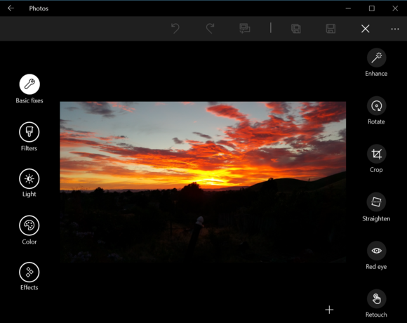
Click the “edit” stencil in the Photos app for Windows 10 and a number of powerful editing tools open up.
Click the “edit” stencil in the Photos app for Windows 10 and a number of powerful editing tools open up.
Click the “edit” stencil in the Photos app for Windows 10 and a number of powerful editing tools open up.
On the left you’ll find two headers: Collection and Albums. Collection is just your Camera Roll, renamed: a grab bag of photos you’ve shot or images you’ve saved, organized chronologically. (Don’t be afraid to click on the monthly headers, as that will take you to a month-by-month index, terrific for finding photos of Christmases past, for example.) I also really like the option to show just one of several duplicate photos from your online collection. It’s not quite a de-dupe function, but close.
Windows 10 also invites you to upload a series of related photos to the My Photos folder on Windows 10, where it will create an album for you.

This may be old hat by now, but the month-by-month index in Photos is still handy.
This may be old hat by now, but the month-by-month index in Photos is still handy.
This may be old hat by now, but the month-by-month index in Photos is still handy.
Click on a photo, and a wealth of options opens up. The Edit icon loads the editing tools: You can play with color and lighting, add effects, crop, straighten, eliminate red eye, retouch – or even do it all in one fell swoop with the “enhance” button. (Note the swirly-arrow Undo and Redo options at the very top, as well as the Compare option.) Some controls are weird, though. If a radial dial appears with a number in the middle—such as Contrast, for example—move the large circular control around the outside of the circle to adjust it.
Photos doesn’t have all the options of say, a Lightroom, but we’d say the app is on a par with, if not better than, Adobe Photoshop Express for Windows.
More Windows 10 apps: Music, Maps, Movies & TV, Mail & Calendar
(Groove) Music: let’s jazz it up a bit
While Microsoft now shies away from using the term “Xbox” in conjunction with its Music application, the Music app remains virtually unchanged from Windows 8. It first asks you to sign in, if you haven’t already, then loads your existing music catalog in a snap—far quicker than it did on Windows 8, incidentally. If you’ve uploaded any music into the Music folder in OneDrive it will add those songs, too, complete with metadata and album art that it can cull from the Internet. Ideally, of course, you’ll already own an Xbox (sorry, Groove) Music pass, and can stream as much as you’d like.
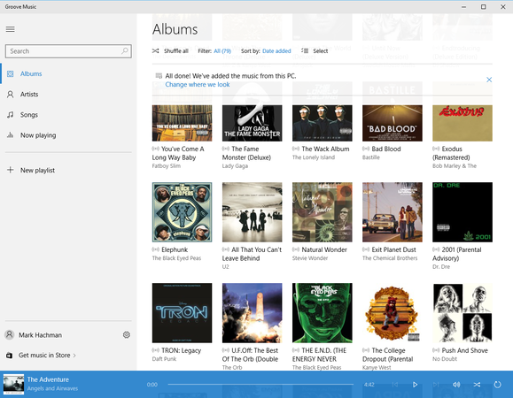
This is probably the liveliest page within Groove Music, previously known as Music. Xbox Music for Windows 8 was far more interesting.
This is probably the liveliest page within Groove Music, previously known as Music. Xbox Music for Windows 8 was far more interesting.
This is probably the liveliest page within Groove Music, previously known as Music. Xbox Music for Windows 8 was far more interesting.
Unfortunately, Music suffers from the same plain aesthetic noted elsewhere in this review: while the Artist and Songs index pages includes artist snapshots, the actual page where the song lives includes just two pieces of art. For music! Geez, Microsoft, my tastes are boring enough. This app badly needs biographical information, lyrics, a link to Bing Video—something. At least hero art is buried inside the “Now Playing” portion of the app. But Windows 8 did Music far better.
Oh, and why in the world isn’t the music equalizer linked within the app? Can I rip a CD using Windows 10? Music offers just the basics. Microsoft can do better.
Maps: so close to great
Some of Microsoft’s offerings, such as Music, arguably work best as dedicated apps. Others, such as Maps, should probably be passed over in favor of a website, at least on a Windows 10 PC.
Maps is a Universal app that spans both desktop PCs and phones, and is downright elegant to boot. The black motif of the app presents the maps and Streetside street-view images to best effect.

Several cities in Windows 10 Maps, such as San Francisco, are rendered in 3D. It’s a gimmick, but an attractive one.
Several cities in Windows 10 Maps, such as San Francisco, are rendered in 3D. It’s a gimmick, but an attractive one.
Several cities in Windows 10 Maps, such as San Francisco, are rendered in 3D. It’s a gimmick, but an attractive one.
But the app lacks depth. You can view a map in either an aerial or live traffic view, and chart directions from place to place. But directions aren’t sent to your phone, as if it were OK for you to consult your laptop as you drive.
Other aspects of the Maps feel a little flimsy. There’s no context given for locations, such as hours of operation, phone number, or nearby attractions. Once you’re viewing a 3D city, there’s no obvious way of backing out into a 2D view again. Unless you type in a given address, it’s seemingly impossible to figure out how to trigger the Streetside view option. (My son loves to pick a random country and just roam from street to street, soaking up what life is like in, say, Belgium.) Finally, I would like the option of clicking a restaurant on the map and pulling up a sidebar with contextual information.
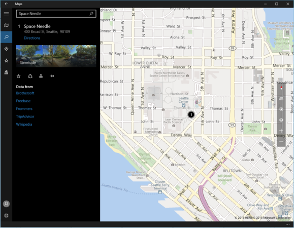
Maps allows you to search for a location, but only surfaces the barest amount of contextual information. But you can drill down deeper.
Maps allows you to search for a location, but only surfaces the barest amount of contextual information. But you can drill down deeper.
Maps allows you to search for a location, but only surfaces the barest amount of contextual information. But you can drill down deeper.
Microsoft offers all this—on its Bing Maps Web site (or Google Maps, if you’re so inclined). You may as well visit there first.
Movies & TV: Microsoft mails it in
The Movies & TV app was spare to the point of unbelievability, but it’s now a bit better. At first launch, there’s very little beyond four words on the left-hand rail: Movies, TV, Videos, and Downloads. The latter is populated only if something is being downloaded in the background. Otherwise, both TV and video are populated only by content you’ve purchased from Microsoft, or from ripped videos you own (right?).
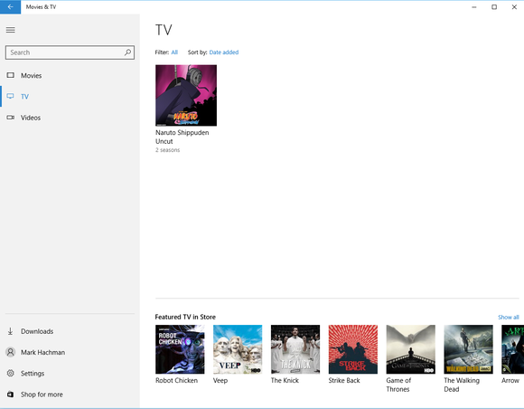
The Movies & TV app is rather lifeless in Windows 10.
The Movies & TV app is rather lifeless in Windows 10.
The Movies & TV app is rather lifeless in Windows 10.
Even more disappointingly, there’s no way to organize your videos. The app doesn’t allow you to edit metadata, nor can you create any new folders. That’s simply basic functionality that should have been in there since the beginning.
At least the app supports a number of modern streaming codecs. Which ones? Well, Microsoft doesn’t actually tell you.
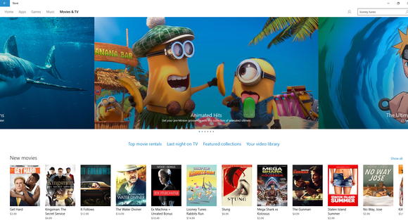
Fortunately, Microsoft’s Movies & TV store makes up for the app’s boring design.
Fortunately, Microsoft’s Movies & TV store makes up for the app’s boring design.
Fortunately, Microsoft’s Movies & TV store makes up for the app’s boring design.
The lone bright spot is Microsoft’s actual Movies & TV store—once you get there. There’s a wealth of content to buy and rent, at reasonable prices. Just enter your password (or your PIN) and, provided you have a credit card on file, it’s yours. There are a number of caveats, though, which are worth reviewing.
Mail and Calendar: a very capable free app
Until recently, accessing your Exchange-hosted email and calendar on a smartphone was a bit of a trick. On Windows, where you can either browse via a website or a native app like Outlook, reading email is rather basic. And so is the Mail app, as it turns out.
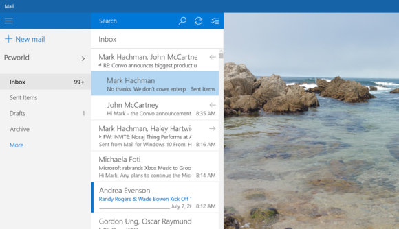
Nothing fancy, but Windows 10 Mail gets the job done. And you can even specify a custom background to liven things up.
Nothing fancy, but Windows 10 Mail gets the job done. And you can even specify a custom background to liven things up.
Nothing fancy, but Windows 10 Mail gets the job done. And you can even specify a custom background to liven things up.
Mail follows Microsoft’s free productivity app strategy—it does nearly everything you want: reading email, browsing attachments, even modern conveniences like Microsoft’s Clutter, which filters out the less-important email that doesn’t quite qualify as spam. About the only real deficiency I noted was Microsoft Edge’s inability to open a PDF file that had been emailed to me, as well as the lack of out-of-office notifications. Well, that and the lack of a standard signature file and out-of-office notifications. For that, you’ll need Outlook.
Mail has definitely improved. When I tried to hunt down an old email a week or so back, Mail couldn’t find it. Now it can, across Exchange and Outlook and more.
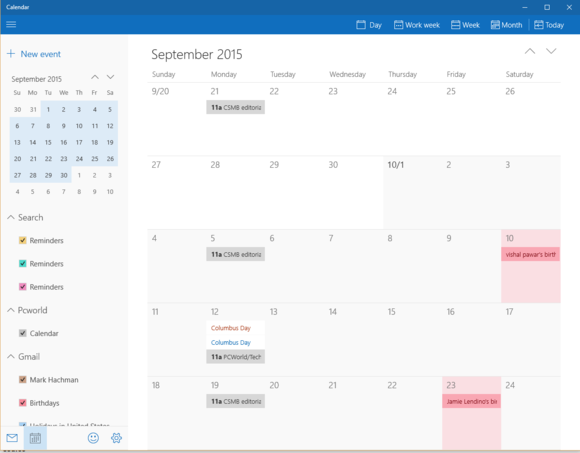
Windows 10 Calendar shows I don’t have much scheduled for September, but recurring meetings and birthdays are already filled in.
Windows 10 Calendar shows I don’t have much scheduled for September, but recurring meetings and birthdays are already filled in.
Windows 10 Calendar shows I don’t have much scheduled for September, but recurring meetings and birthdays are already filled in.
As you might expect, Mail doesn’t maintain the tabs that Gmail does (Promotions, Social, Updates, and the like), instead dumping them all out into one giant stream. The related Calendar app can also a bit crowded once you let in all the stuff you sort of have to tolerate: the inevitable birthdays of Facebook friends, U.S. holidays, plus your personal and work calendars. There aren’t any quick to-do lists, though—in Microsoft’s world, that’s OneNote’s domain.
Next: Even more Windows 10 apps: Xbox, People, Calculate, Solitaire
The Xbox app: Where you’ll go to relax
Windows 10’s Xbox app is made for gamers, and it’s the portal to Microsoft’s entertainment offerings—or most of them, anyway.
Surprisingly, the Xbox app supports both Windows 8 and Windows 10 PC games that were connected to Microsoft’s Live services, as well as games you might have owned and played on either the Xbox 360 or Microsoft’s latest console, the Xbox One. If you own or have played games on any of these platforms, chances are you’ll see a list of those games when you first log in, as well as any achievements you may have completed.
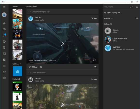
The Xbox app is part social network, part Mission Control for your gaming life.
The Xbox app is part social network, part Mission Control for your gaming life.
The Xbox app is part social network, part Mission Control for your gaming life.
Unlike the similar home screen under your account on Xbox.com, the Xbox app is more like a traditional social network, with a social timeline that dominates the app. Here you can chat with your friends, share game clips, and track your achievements—both what you’ve already accomplished and what you hope to achieve. You can also “follow” games and gamers.
The Xbox app could eventually morph into something like Twitch, the existing game streaming service owned by Amazon. But the real selling point of the Xbox app is its ability to stream games from the Xbox One to the Windows 10 PC.
Microsoft’s thinking is that if a teen’s parents are downstairs watching Dancing with the Stars, that’s fine. The teen can log in to the Xbox One from upstairs and play anyway.
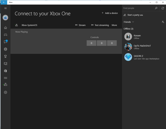
You can connect to your Xbox One if the WIndows 10 PC and the Xbox One are on the same network.
You can connect to your Xbox One if the WIndows 10 PC and the Xbox One are on the same network.
You can connect to your Xbox One if the WIndows 10 PC and the Xbox One are on the same network.
Streaming a game requires both the Xbox One and the Windows 10 PC to be set up to allow game streaming. Within the app, you simply navigate down the lefthand nav bar until you reach the Connect button, then find the Xbox One on the network. You can then either hand-select a game that you already own to play from the app itself, or stream the Xbox One interface itself. Note that you’ll also need to own an Xbox One or Xbox 360 controller to play; neither mouse nor keyboard are allowed.
Setting up game streaming for the first time is a bit tricky. I found I had the best results when the Windows 10 PC was connected wirelessly, and the Xbox One was powered on. Once connected, though, I found I could power up the Xbox One remotely and play from a PC connected via ethernet.

If you click on a game within the Xbox app, it might take a few seconds for this screen to load. Click on “Play from console” to begin streaming.
If you click on a game within the Xbox app, it might take a few seconds for this screen to load. Click on “Play from console” to begin streaming.
If you click on a game within the Xbox app, it might take a few seconds for this screen to load. Click on “Play from console” to begin streaming.
“Your mileage may vary” is a good rule of thumb for the Xbox game streaming experience. Latency determines whether your trigger will fire the game’s blaster at the right time. The farther you’re away from the router, the more chance the game video will start smearing. (You can also use a wired ethernet connection.) The app therefore requires you to be on the same network as the Xbox. In general, though, I found the video quality to be pretty close to the One’s native 1080p resolution, with little latency, even when streaming Forza Horizon 2, a racing game. It definitely works.
Eventually I suspect Microsoft may tuck the TV & Video app inside the Xbox app. Yes, I’m aware that gamers want the Xbox One to focus on games first. But if you’re going to watch video, you may as well watch it on the TV, which an Xbox is typically connected to.
Other apps: Some old favorites remain
Some of the best apps in Windows 10 remain essentially unchanged from Windows 8, including Sports, Weather, News, and Money. They’re excellent sources of information. Sure, your broker may have more concrete insights than the Money app, and ESPN might deliver a more comprehensive view of the July baseball trade market. But for the casual fan (are there casual fans of weather?), the topical Windows 10 apps fit the bill. (Microsoft has decided that some of its other apps, such as the Travel app, will eventually be relegated to Web sites.)
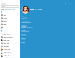
Microsoft’s People app is of limited use, since most contact information is used in the app in which it is needed, like Outlook.
Microsoft’s People app is of limited use, since most contact information is used in the app in which it is needed, like Outlook.
Microsoft’s People app is of limited use, since most contact information is used in the app in which it is needed, like Outlook.
One exception to these is Microsoft’s People app, which I’ve never quite understood. People filters information like a traditional Rolodex: name, phone number, email, et cetera. I’m just not sure how many people use People as their jumping-off point for reaching out. If I want to email someone, I open Mail or Outlook and enter my contact’s name. Ditto for my phone, Facebook, or Twitter. People’s sort of the appendix of Windows past, and I probably wouldn’t miss it if Microsoft’s engineers removed it.
Microsoft also includes some other somewhat insignificant apps within Windows 10: Alarms & Clock, for example, does nothing that your watch or phone (or Outlook) doesn’t already do—although it can pop up a visual alert at a given time, too. In the case of the Calculator app, the drab appearance hides several useful calculators and converters. For basic arithmetic, however, remember that you can also ask Cortana.
The Windows Accessories folder also hides some of the older apps, including WordPad, Paint, and the Clipping Tool. None of these seems to have been updated, and the Math Input Panel seems as useless as ever.
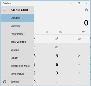
Windows 10’s Calculator app: vanilla in appearance, but robust in features.
Windows 10’s Calculator app: vanilla in appearance, but robust in features.
Windows 10’s Calculator app: vanilla in appearance, but robust in features.
I probably should have listed Microsoft’s Solitaire Collection among the best apps Windows 10 offers. Just look at it (below): It’s gorgeous, with design elements I would have loved to see influence other apps within Windows 10. And it’s not just one game—it’s a bunch. Minesweeper’s there, for example—not only is a version of the classic game included, but so is a new derivative, Treasure Hunt. There are several Solitaire variations, Mahjong, Sudoku, slots, and bingo. Eventually, there will be leaderboards, Microsoft promises. (Note that the app can still kick you out to the Microsoft Store to download apps, however. One question: why does a game like Mahjong take almost 250 megabytes?
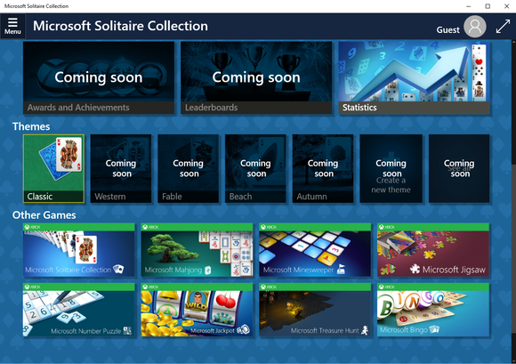
Microsoft’s Solitaire app has a vibrancy about it that makes other aspects of Windows 8 pale by comparison.
Microsoft’s Solitaire app has a vibrancy about it that makes other aspects of Windows 8 pale by comparison.
Microsoft’s Solitaire app has a vibrancy about it that makes other aspects of Windows 8 pale by comparison.
Microsoft doesn’t actually include a Skype app in Windows 10. Weirdly, there’s a Get Skype app that’s simply a “hey, click this link to get Skype” Web page. Finally, for those who wish to use Windows 10 to connect to a 3D printer, there’s the 3D Builder app, which we didn’t test.
There’s even some apps, like Movie Maker, which emerge from the hidden underworld of Windows Essentials 2012 and appear in Windows 10.
Finally: Our review verdict, and what’s next for Windows 10
Conclusion: Windows 10 charts a better course
Microsoft’s customers have grown used to floating lazily from one Windows release to the next…Windows 95, 98, XP…rousing as they bumped through the rapids of Windows Vista, then relaxing again as Windows 7 flowed gently ahead for several years. Then— SPLASH!—as Windows 8 landed, customers sputtered and swore. Some jumped ship. Since then, everything that Microsoft has done has been designed to lure customers back into that comfortable, productive world that Windows established.
For me, that’s been achieved. Windows 10 feels like Windows; I made the mental shift from Windows 8.1 to Windows 10 during the weeks I’ve spent with it as a Windows Insider. That was a very clever tactic, by the way, to encourage users to overcome their unfamiliarity with the OS as beta testers.
I don’t like the Edge browser. I do like the vast majority of Windows 10, even with the bugs. Microsoft needed an additional month or more to buff out more dings and dents on its new OS, but in the new world of continual updates, maybe that’s the wrong attitude.
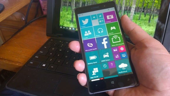
What’s next for Windows 10? Windows 10 Mobile.
What’s next for Windows 10? Windows 10 Mobile.
What’s next for Windows 10? Windows 10 Mobile.
Over the next few months, Microsoft will deliver Windows 10 Mobile, plus a few of the Windows 10 updates to the eagerly anticipated HoloLens and even the Xbox One. During that time, we expect a more cohesive Edge experience and—fingers crossed—some aesthetic tweaks to Microsoft’s apps as well. Only then will Microsoft’s ambitious Windows 10 vision be fully realized.
We haven’t changed our verdict, or our score, after retesting with the Windows 10.0 code. Download it, definitely. Not only is it free to the vast majority of customers, it’s a sizeable improvement over both of Microsoft’s prior operating systems. Microsoft, to its very great credit, has assumed a corporate persona of humility and responsiveness that it’s previously lacked. If there are problems—and there are—we have every confidence they’ll be fixed.
Updated at 11:14 AM to highlight the presence of Internet Explorer and the Windows Accessories folder. Updated at 12:03 AM on July 26 to link our previous story on Windows 10 benchmarks. Updated at 2:33 PM on July 30 with retesting following the release of Windows 10.0 code.

Author: Mark Hachman, Senior Editor

As PCWorld’s senior editor, Mark focuses on Microsoft news and chip technology, among other beats. He has formerly written for PCMag, BYTE, Slashdot, eWEEK, and ReadWrite.
Recent stories by Mark Hachman:
Windows Recall could solve my biggest problem in techA new Xbox cloud feature lets work laptops play like gaming PCsMicrosoft’s patch fixes the update that broke VPNs on Windows


