 Image: Rob Schultz
Custom interactive forms are one of Word’s most sophisticated tricks. More than a simple design tool, the form tools let you collect specific information and export to Excel, Access, or XML.
Start in the Developer tab
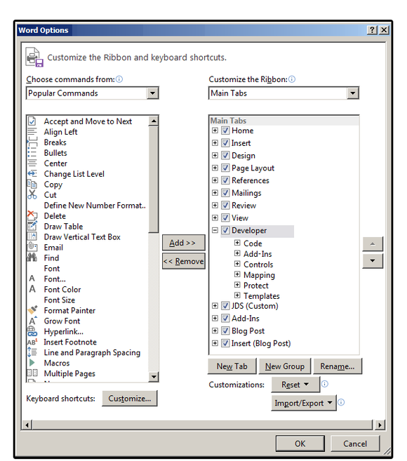
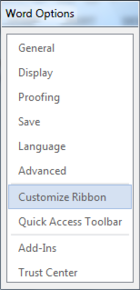
You create custom forms in the Developer tab. If the Developer tab is not currently visible on your Ribbon menu, select File > Options > Customize Ribbon. Click the Developer checkbox in the Main Tabs panel, and click OK.
Learn the Controls group options and tools
When the main document screen reappears, click the Developer tab. Notice the icon buttons on the left side of the Controls group. These are the main controls used for interactive forms. The icon buttons on the right side of the Controls group are used to define the properties and format the attributes for each Content Control button. Each Control is defined below:
Rich Text Content Control: contains a block of text (including attributes) plus additional content types such as tables, images, or other content controls.
Plain Text Content Control: contains just plain text—that is, no other content controls, images, or tables. Attributes are included, but only one attribute is applied to the entire text control; e.g., if you underline one word, all the text is underlined.
Picture Content Control: This one, obviously, contains images.
Building Block Gallery Control: Use this control to insert blocks of data into documents such as custom text, custom tables, custom equations, custom quick parts, etc. These blocks are generally defined in advance and saved in the Building Block Gallery (which is part of the Quick Parts Gallery).
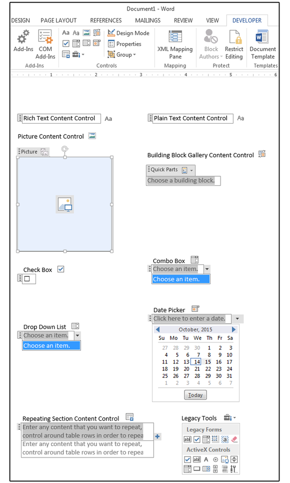
Check Box: Use this to solicit a yes/no type of response (selected is generally yes, and not -elected is no).
Combo Box: Use this control to provide users with a list of selectable items plus an option to add/enter their own responses, which are not included in the list.
Drop Down List: a pre-programmed group of items, which users can select from a list.
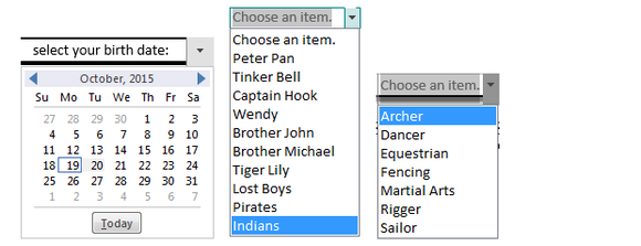
Date Picker: Use this to select a date from a pop-up calendar.
Repeating Section Content Control: Use this control to enter repetitive content (e.g., to repeat parts of a table, text, etc.) including other content controls.
Legacy Tools: Theseform field types were available in previous versions of Word; that is, Word 97 through 2003. You can still use them in Word 2013, but these forms must be saved in one of the previous legacy formats (i.e., Word 1997 or Word 2003).
Create a form
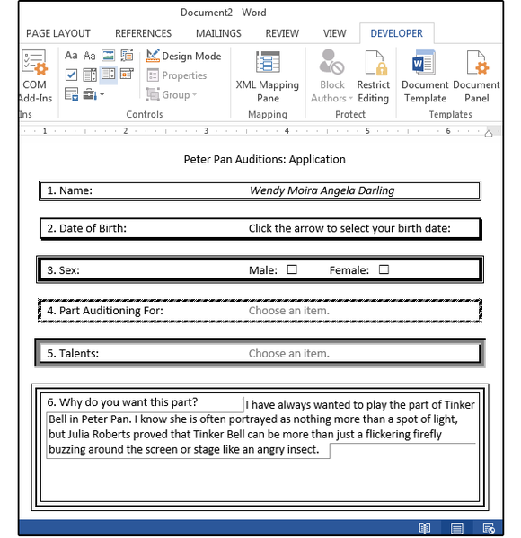
We’ll create a simple application, with questions that must be filled out or selected from a list of options.
First, select the application type you want to create, then decide which questions (or fields) you want to ask your audience. For this exercise, let’s try an application for auditions for the play Peter Pan. Use the following fields/questions.
Name (Plain Text)Date of Birth (Date Picker)Sex (Check Box)Part Auditioning For (Drop Down List)Talents (Combo Box)Why do you want this part? (Rich Text)
Enter or copy and paste the six fields above to a new, blank document, then click Developer > Controls > Design Mode to see the options you select as you build the form.
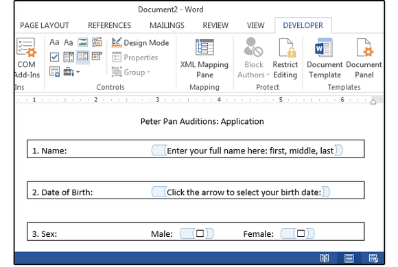
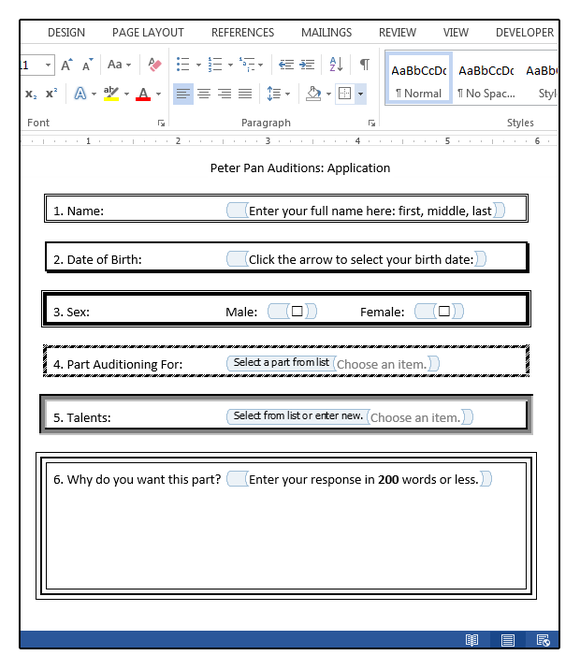
1. Position the cursor beside the first field: “Name.” Press the tab key a few times to move the cursor a few columns to the right. Click the Plain Text Content Control button. Enter your custom text (e.g., “Enter your full name here: first, middle, last.”) over the existing text.
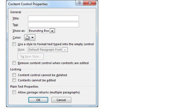
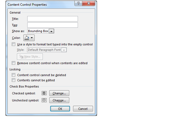
Next, click the Properties button to add a title and/or tag; change the border, color, or style; and set or define several content control properties related to the Name field.
Note: Except for the attributes, most designers skip this section.
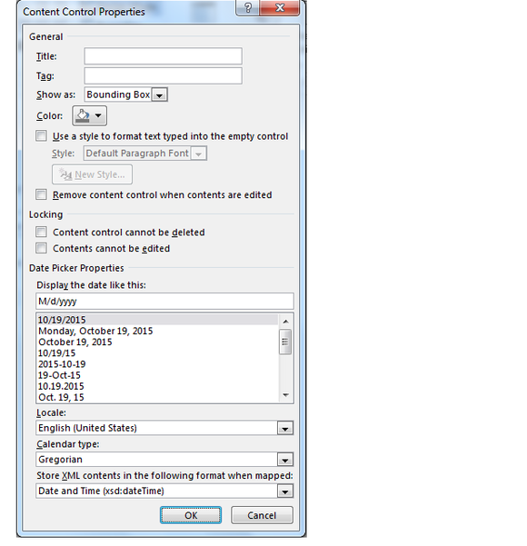
2. Move to the second field: “Date of Birth.” Press a few tabs to align with the field above, then select the Date Picker button. Again, enter your custom text over the existing text (such as, “Click the arrow to select your birthdate”). Click the Properties button to add a title or tag; change the border, color, or style; set the date format, and define several content control properties related to this field.
3. For the third field, Sex; type Male, then select the Check Box button. Press the spacebar a couple of times, then type Female and click the Check Box button again. Click the Properties button to add a title and/or tag. Change the border, color, or style; set the check box format; and define several content control properties related to this field.
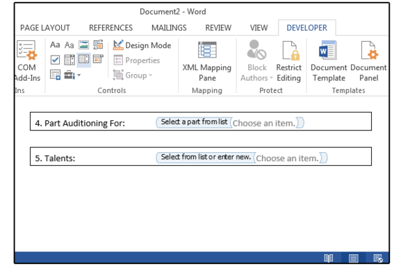
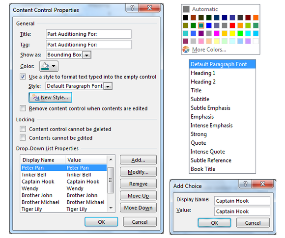
4. Move to the fourth field: “Part Auditioning For.” Press a few tabs to align with the field above, then select the Drop Down List button. Enter your custom text over the existing text, then click the Properties button to add or change the properties like before.
For these types of fields, you must enter some responses for the users to select from a list. At the bottom of this window, under Drop Down List Properties, click the Add button to add selections to the list. Use the remaining buttons to modify, remove, or move items up and down.
5. Move to the fifth field: Talents. Press a few tabs to align with the field above, then select the Combo Box button. The Combo Box functions exactly like a List Box except, in addition to a list of items, users can add their own custom items. The Properties dialog is exactly the same as the Drop Down List dialog, with Add, Modify, and Remove buttons.
Note: The maximum number of items allowed in a single Drop Down or Combo list is 25.
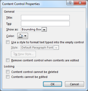
6. Position the cursor beside the last field: “Why do you want this part?” Press the tab key a few times to move the cursor a few columns to the right. Click the Rich Text Content Control button. Enter your custom text, then click the Properties button to change or add information to the Content Control Properties fields.
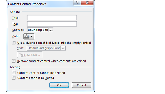
Once the form is complete, consider adding some creative formatting such as artistic borders, shading, and unique fonts. Our example shows six different borders to illustrate the various options that are available, but obviously you’d select just one or two styles for an actual form.
Add borders, colors and more
Highlight each field separately to add a border and/or shading around each application question. To add a single border around the entire form, press Ctrl+A to select all the text.
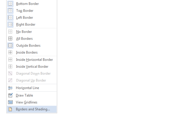
1. Once the target area is highlighted, select the Home > Paragraph > Borders > Borders and Shading.
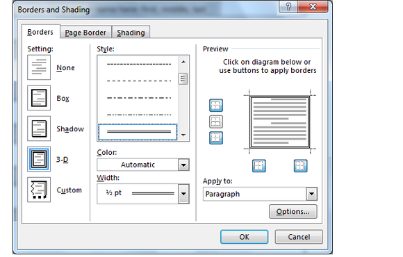
2. From the Borders and Shading dialog box, click the Borders tab, then select border settings from the options in this dialog box.
3. Notice the options on the right side of this dialog box under Preview. Use these icons to add or remove the selected border from the top, bottom, left, right, or center of the target area.
D. When finished, click OK. Test your custom form: Answer the questions, fill in the blanks, select items from the list, and click the check boxes to ensure that everything is working properly. Once you’re satisfied with the form, save it, and then distribute it to the applicants.
